Role: UX/UI Designer

Duration: August 2024 - April 2025

Scope: Research, UX, UI, Design System, Prototyping

View Live App
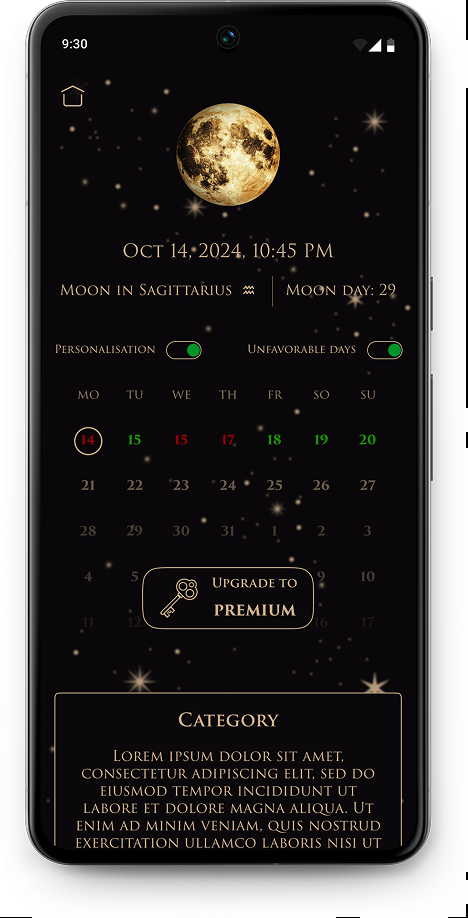
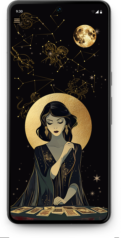
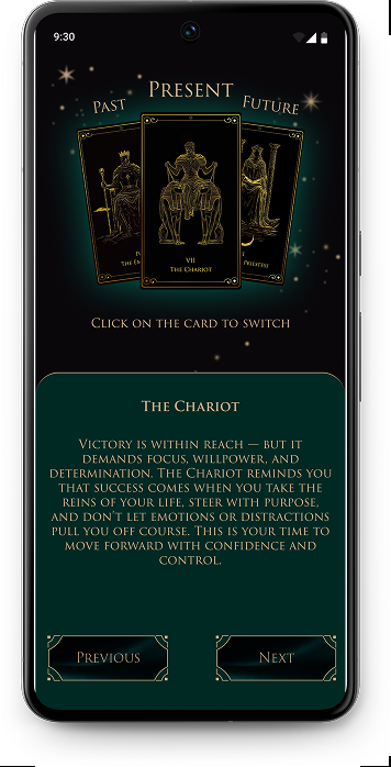
Destiny application zodiac screen Destiny application tarot reading screen Destiny application card selection screen

Destiny

Application

Goal

Design an intuitive and visually appealing app that delivers both personalized and general esoteric content — such as tarot spreads, lunar calendar insights, and horoscopes — catering to the needs of both dedicated and casual users through flexible features and pricing.

Problem

Users of esoteric practices have different engagement levels: dedicated users need reliable and personalized guidance for self-growth, while casual users prefer light, accessible content without complexity or commitment. Current apps often fail to serve both groups effectively within one platform.

What we learned from users

Sun illustration

I conducted 6 unmoderated interviews with users who engage in esoteric practices at different levels to understand their motivations, feature expectations, and visual preferences.

Man speaking illustration

“I would most like to use features such as tarot spreads, horoscopes, a lunar calendar, numerology calculators, and meditations.”

Woman speaking illustration

“I’d like it to be something simple, without scary images of demons — just clean, minimalistic, and user-friendly.”

Based on user interviews and synthesis of qualitative research, the following insights emerged:

  • Users are interested in a single app that combines multiple esoteric features.
  • Personalization is critical to perceived value and long-term engagement.
  • A calm, minimal visual style increases trust and approachability.

Journey-based insights

To reduce early friction, users need to explore core features before encountering paywalls. Gradual personalization, minimal ads, and a clear onboarding flow were critical to maintaining trust and engagement.

Defining

Problem Statement

Star illustration

Esoteric apps often fail to balance depth and accessibility.
Engaged users expect reliable, personalized guidance, while casual users seek light, intuitive exploration.
Most existing solutions focus on only one of these needs, forcing users to choose between complexity and simplicity.

Ideation

How might we

Moon illustration

How might we provide personalized and meaningful insights within the app to ensure that dedicated users receive valuable and tailored content that enhances their personal growth?

Create personalization using AI that takes into account all the information the user provided about themselves at the time of registration.

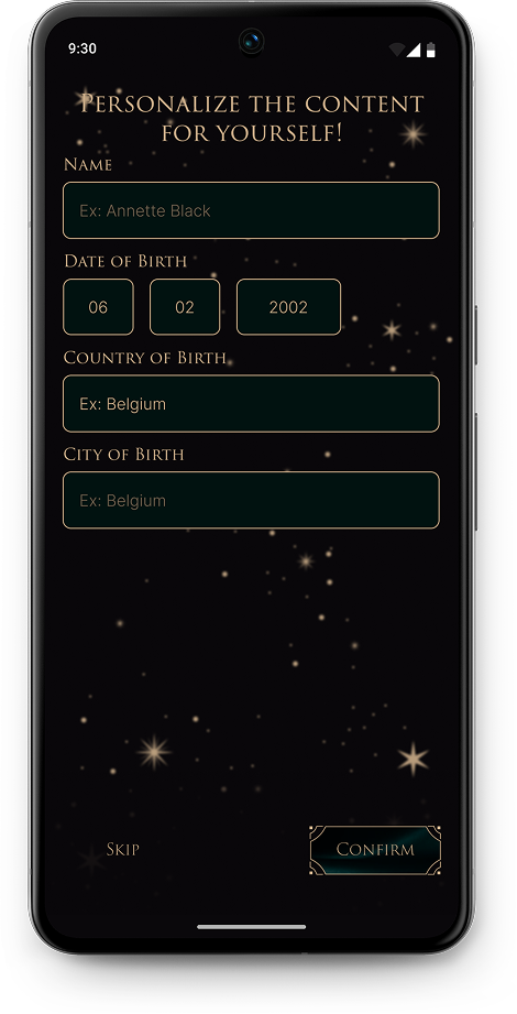
Allow users to add personalized information during registration, such as their name, date of birth, city, and country of birth.

Add the ability to immediately provide feedback (e.g., "Do you like this tarot reading?").

How might we design a flexible subscription model that caters to both dedicated users who are willing to invest in premium features and casual users who prefer free or low-cost options?

Open all paid features to all registered users for a week so they can try them and determine if they are needed.

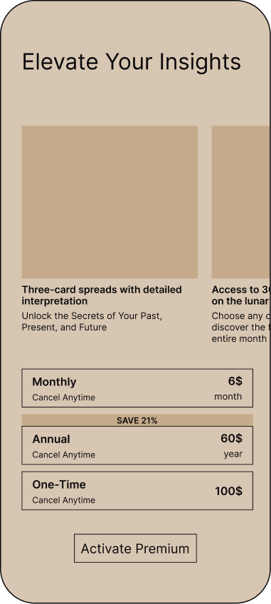
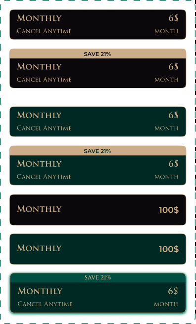
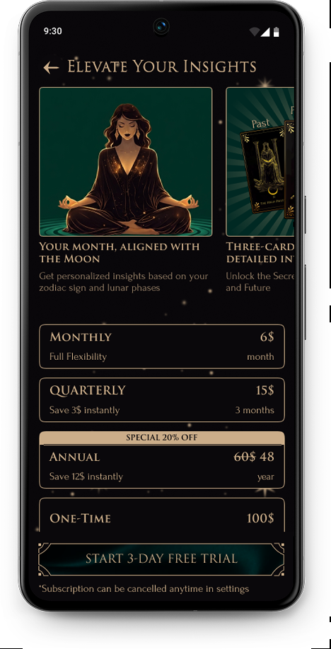
Offer a budget-friendly subscription that includes a personalized lunar calendar, unlimited personalized tarot readings on all life areas, and no ads.

Provide free functionality such as the card of the day, the Celtic cross, and 3-card spreads—each available once per day maximum—and a lunar calendar for the whole year without personalization.

Early structure & flow

Wireframes

Tarot icon
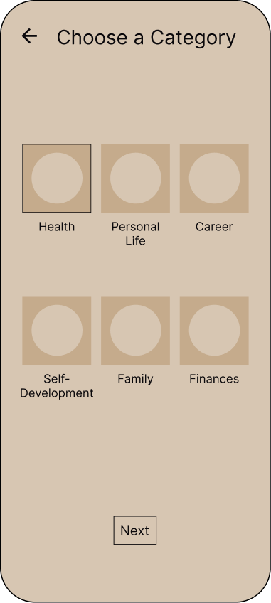
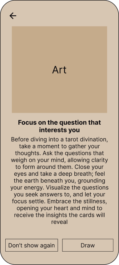
Menu wireframe Zodiac signs wireframe Moon calendar subscription wireframe Menu sidebar wireframe Categories wireframe One card wireframe
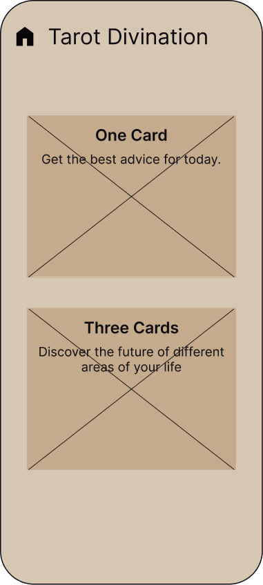
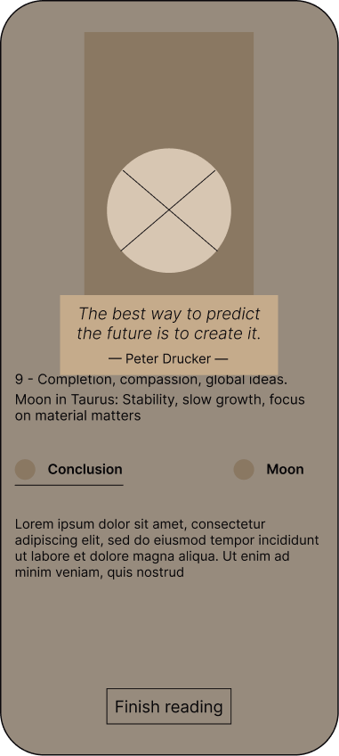
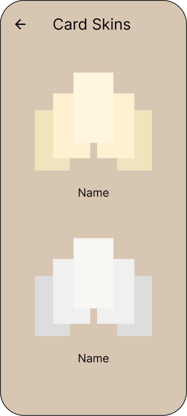
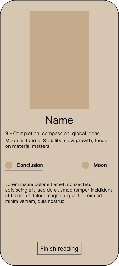
Tarot divination wireframe Premium wireframe One card quote wireframe Card skins wireframe Opened card wireframe Cards wireframe

A stylized tarot card set

Tarot icon

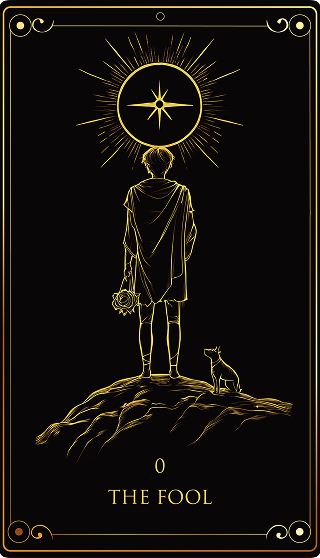
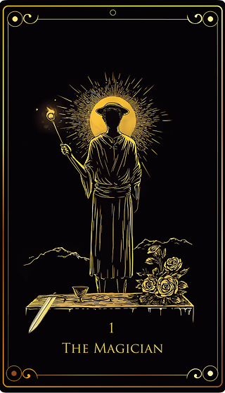
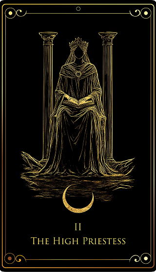
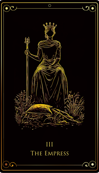
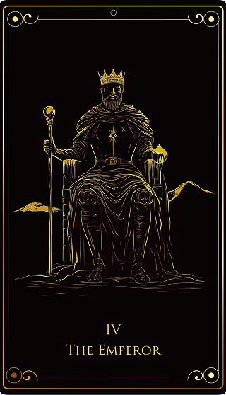
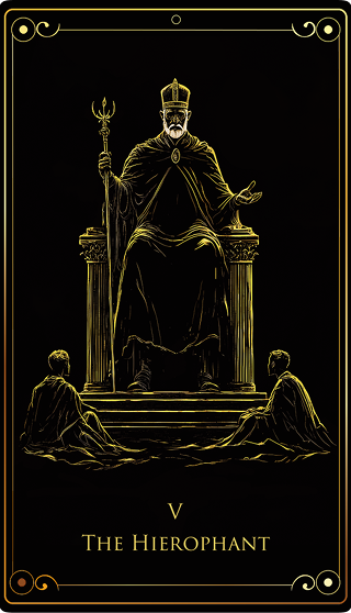
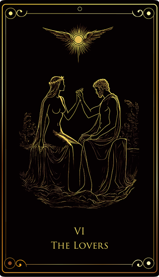
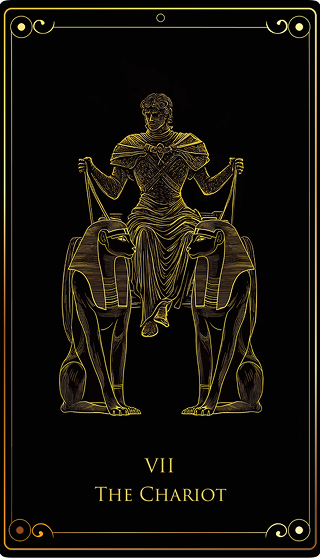
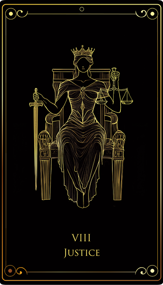
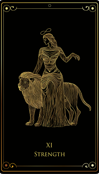
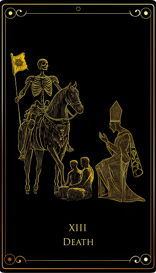
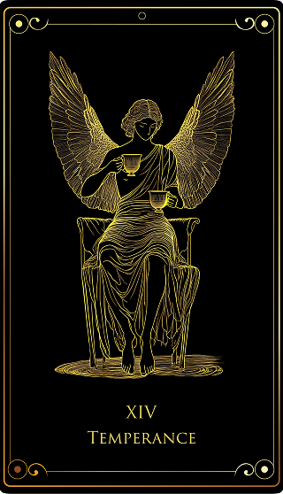
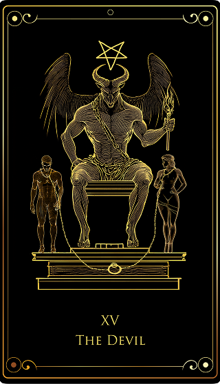
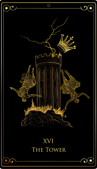
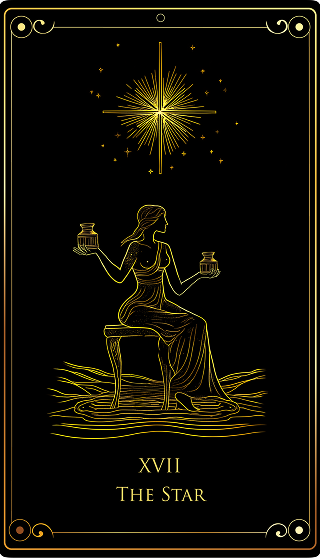
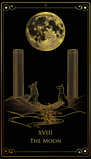
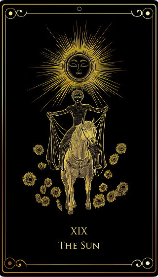
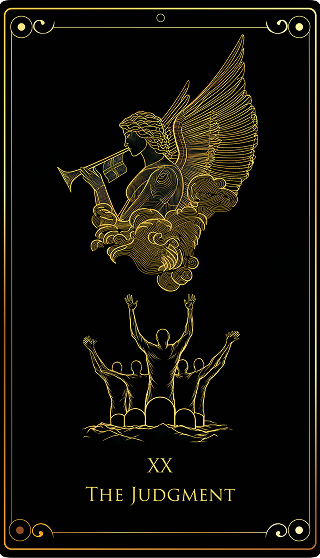
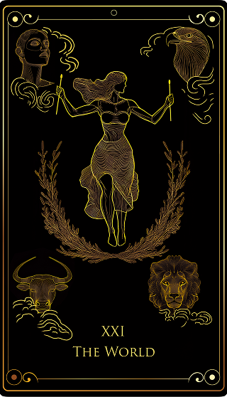
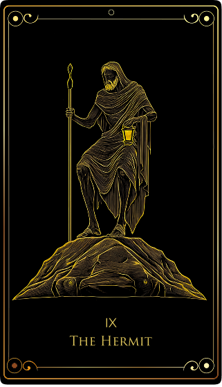
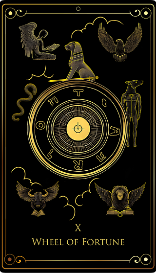
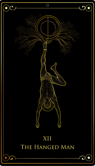
All 22 major arcana were illustrated in a unified visual style to ensure consistency, recognition, and immersion across readings, onboarding, and daily interactions.

The Fool tarot card The Magician tarot card The High Priestess tarot card The Empress tarot card The Emperor tarot card
The Hierophant tarot card The Lovers tarot card The Chariot tarot card Justice tarot card The Hermit tarot card
Wheel of Fortune tarot card Strength tarot card The Hanged Man tarot card Death tarot card Temperance tarot card
The Devil tarot card The Tower tarot card The Star tarot card The Moon tarot card The Sun tarot card
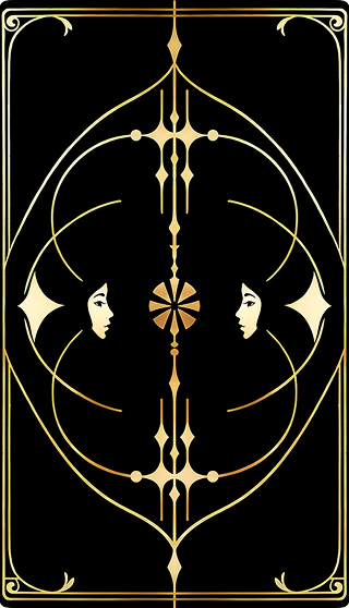
Judgement tarot card The World tarot card Tarot card back cover

Motion as part of the user experience

Tarot icon

Motion was used intentionally to communicate system states, reduce perceived waiting time, and reinforce the ritualistic nature of the experience. Each animation was designed to support a specific user moment rather than serve as decorative motion.

Three loading animations:

Loading states were treated as moments of anticipation rather than passive waiting. Instead of a generic spinner, each loader reflects the app’s core themes and reassures users that the system is actively working.
App launch animation

Creates a calm, immersive transition into the app, setting the emotional tone and reducing friction at first entry.
Stylized symbolic loader

Reinforces the app’s core concepts (tarot, astrology, lunar cycles) while maintaining visual consistency across features.

Lunar phase animation

Communicates progress through a familiar metaphor, making waiting feel intentional and meaningful rather than arbitrary.

Card shuffle animations (2 variations)

The shuffle interaction was designed as a ritual moment, increasing emotional engagement and user focus before revealing the result.

Classic shuffle

Mimics physical tarot card behavior to build trust and a sense of authenticity.

Dynamic shuffle

Offers a faster, more modern alternative for users who prefer efficiency while maintaining a sense of magic and anticipation.

UI System & Visual Components

To maintain visual consistency and scalability across the product, I designed a reusable UI system. It allowed me to iterate faster, keep interactions predictable, and balance a rich visual language with usability.

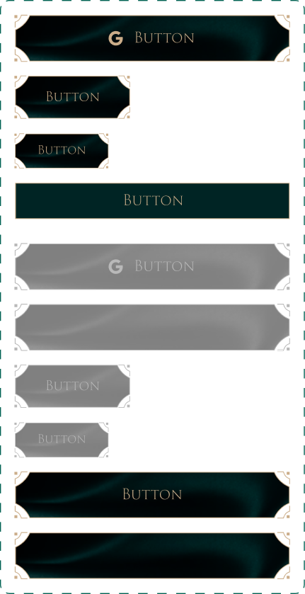
Buttons

Buttons were designed with clear hierarchy and accessibility in mind, ensuring sufficient contrast even on dark backgrounds.

Button states
Don't show again checkbox Upgrade to premium button Checkbox states
Side menu button Skip button Language button

Icons

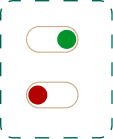
Checkmark Arrow down Switch
Family Finances Health Personal life Self development Career
Earth element Fire element Water element Wind element Help Home Moon Moon variation
Facebook Book Profile Google Skins Tarot Zodiac Premium Anonymous user
Aries Taurus Aquarius Cancer Capricorn Gemini Leo Libra Pisces Sagittarius Scorpio Virgo
Aquarius Aries Cancer Capricorn Gemini Leo Libra Pisces Sagittarius Scorpio Taurus Virgo

Images

Illustrations were created specifically for the product to avoid generic stock visuals and strengthen brand identity.

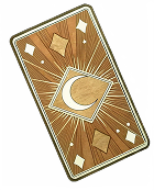
Decorative card Crescent Google art Google image Middle art Owl
Divider decoration Card deck
Prayer illustration Something went wrong illustration Woman illustration
Aquarius Aries Cancer Capricorn Gemini Leo Libra Pisces Sagittarius Scorpio Taurus Virgo

Cards

Aquarius card Aries card Cancer card Capricorn card Gemini card Leo card Libra card Pisces card Scorpio card Sagittarius card Taurus card Virgo card
Plans card
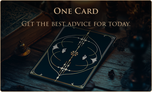
Single tarot card Element button
Cards panel Elements wheel

Modals

Modals were designed to minimize disruption and clearly separate primary and secondary actions.

Modal window
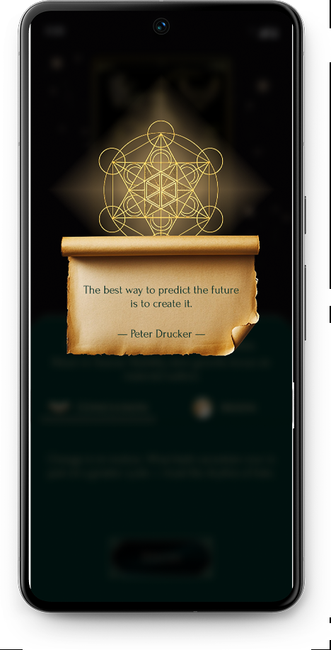
Modal text sample Quote scroll

Forms / Inputs

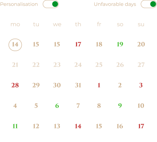
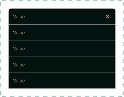
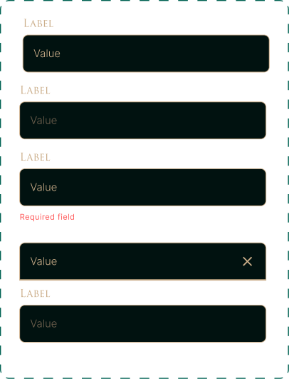
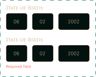
Form elements were designed to remain clear and readable despite the dark color palette, with special attention to focus and error states.

Calendar states Dropdown list Input fields Calendar day picker Date of birth inputs

High Fidelity

Tarot card icon

Authorization

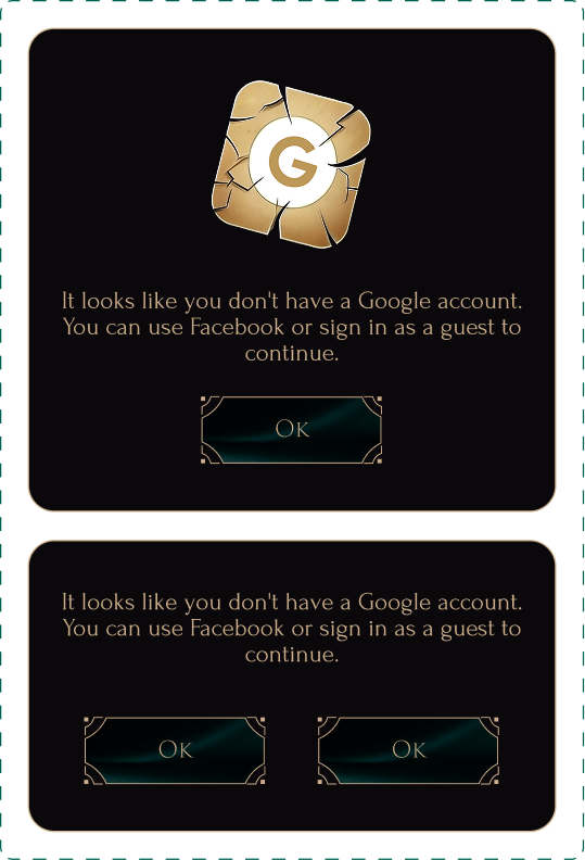
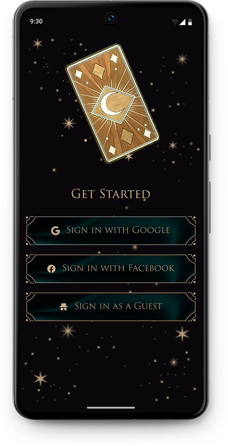
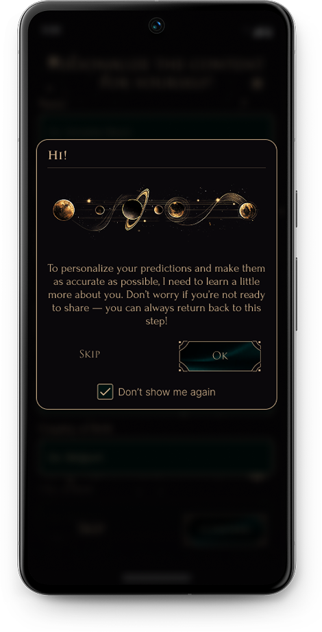
The authorization flow was designed to reduce entry friction while preserving personalization opportunities. Users can sign in via Google, Facebook, or continue as a guest. Optional personalization is introduced through a modal, allowing users to skip it and return later without blocking core functionality.

Get started screen Personalisation screen Information input fields modal

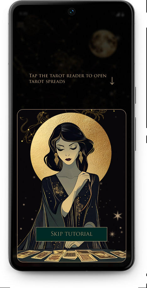
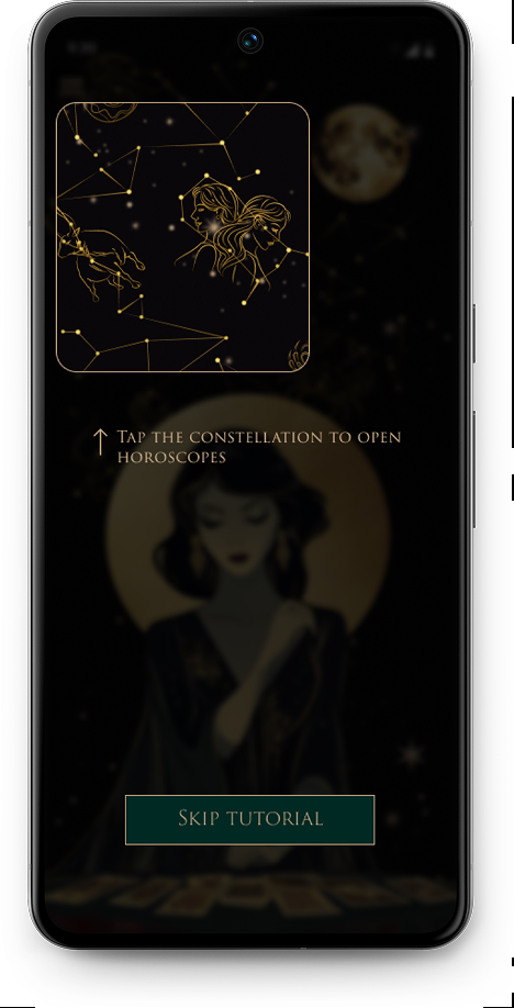
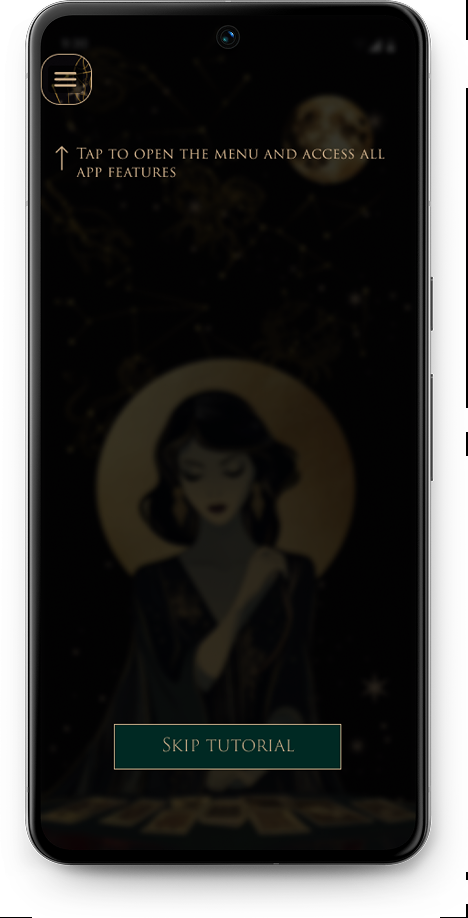
Guided Onboarding Tutorial

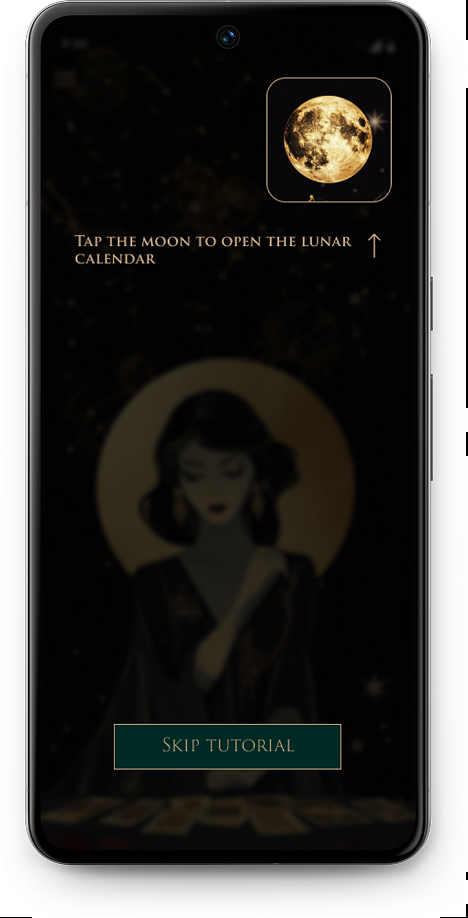
A short interactive tutorial introduces users to the app’s core features: the lunar calendar, tarot spreads, horoscopes, and the main menu. Highlighted tips gently guide attention while preserving the mystical atmosphere and keeping the first-time experience clear and unobtrusive.

Moon calendar guide screen Tarot reader guide screen Horoscopes guide screen Menu guide screen

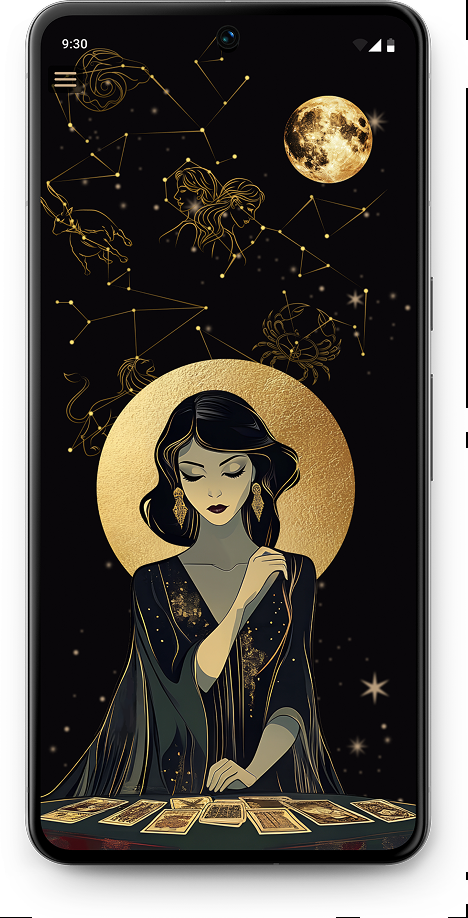
Home Page

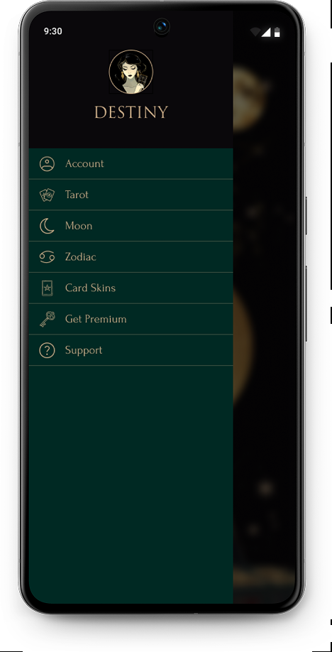
The homepage serves as the central hub, giving users quick access to all core features. Navigation is available both through the side menu and direct visual entry points such as the lunar calendar, horoscope, and tarot spreads.

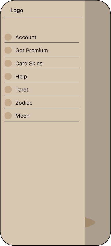
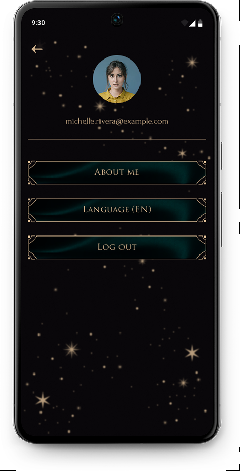
The side menu provides access to account settings, card customization, premium options, and support, ensuring essential actions are always reachable without overwhelming the main screen.

Homepage screen Homepage side window Profile screen Premium screen

Moon Calendar

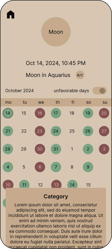
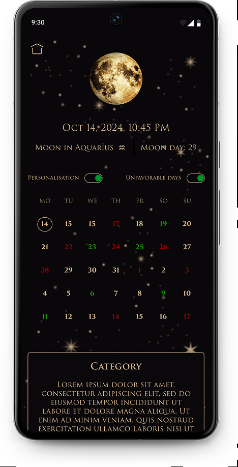
The Moon Calendar helps users quickly identify favorable and unfavorable days for planning the week. Full monthly access is available with a subscription.
To reduce anxiety and give users more control, unfavorable days can be hidden, allowing the calendar to adapt to individual preferences.

Moon calendar premium screen Moon calendar screen

Tarot

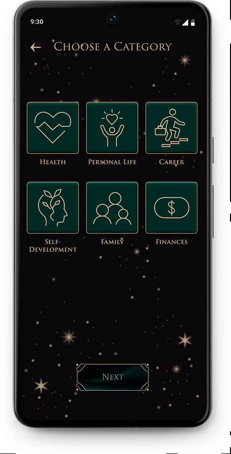
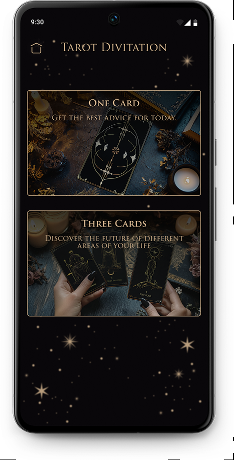
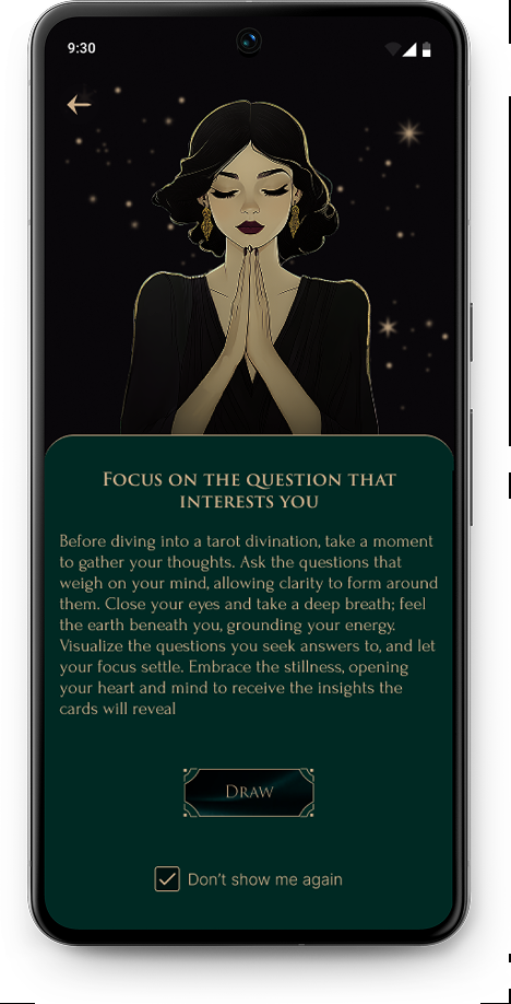
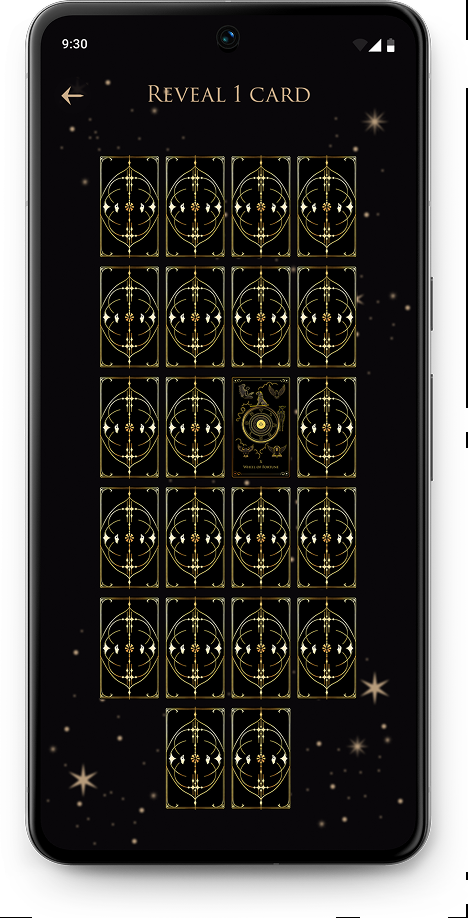
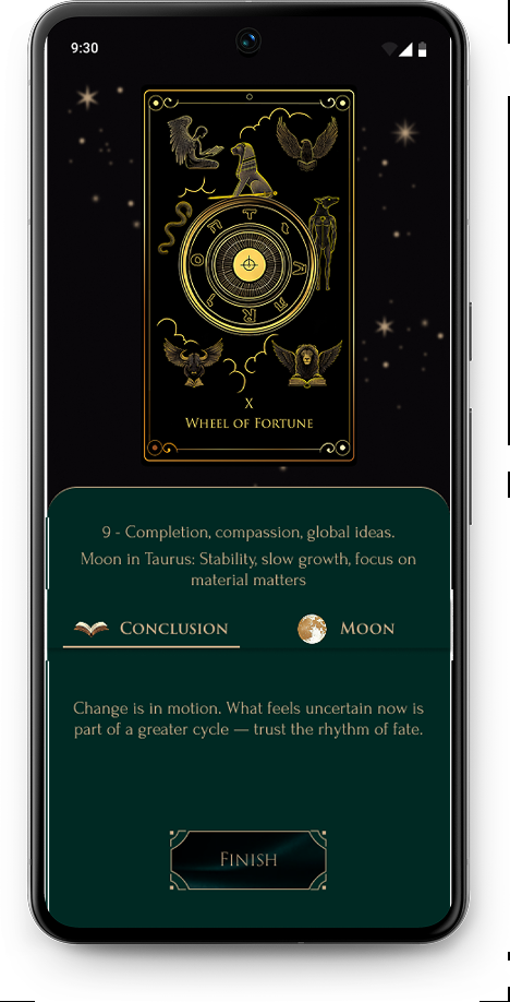
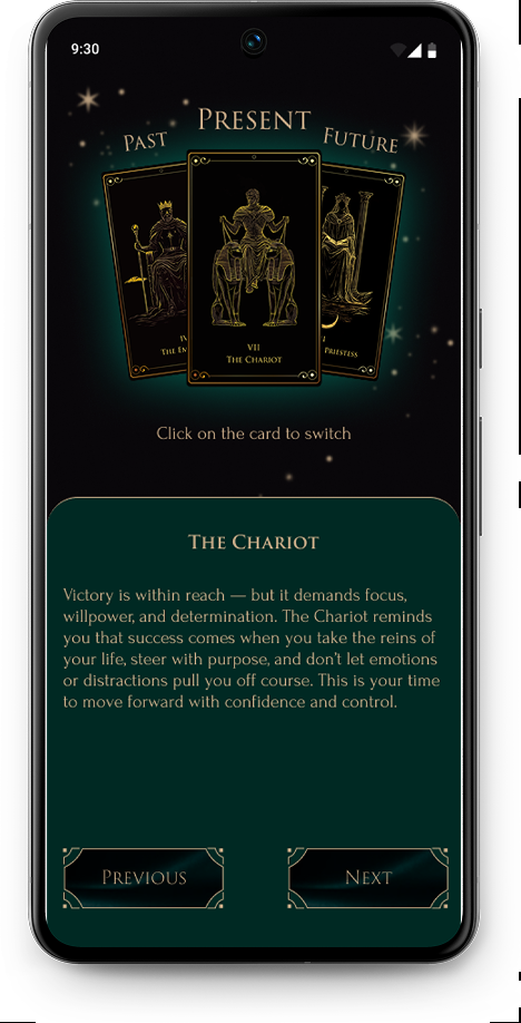
The Tarot flow is designed as a guided yet flexible ritual. Users first choose a relevant life category and a spread type, then move through a short animated sequence that can be skipped at any time.
This approach preserves the emotional depth of tarot practices while respecting users who prefer a faster, more practical experience.

Choose category screen Tarot divination screen One card screen Reveal one card screen Opened selected card screen
Opened card quote screen The Chariot result screen

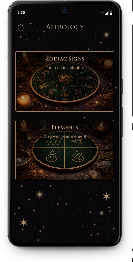
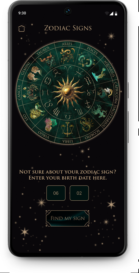
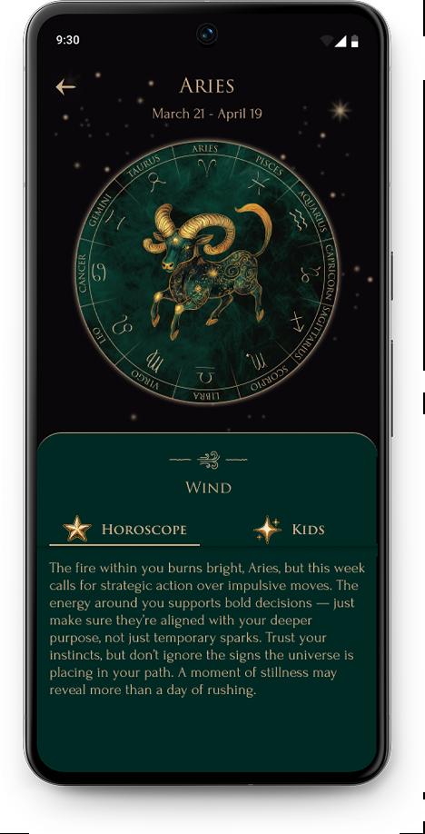
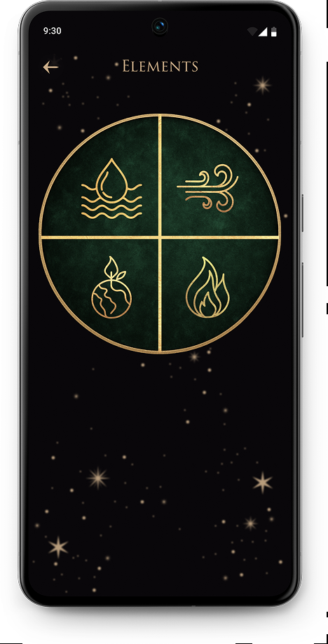
Zodiac Signs

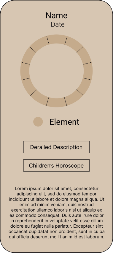
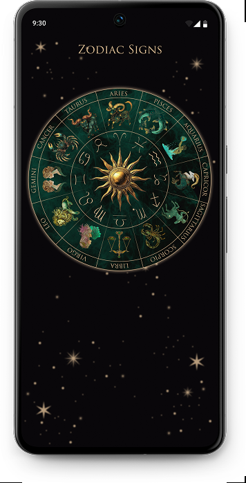
The Zodiac section is built around a circular navigation pattern that mirrors the mental model users already associate with astrology.
Each sign can be explored individually, with optional paths to a children’s horoscope or element-based explanations. This structure allows users to dive deeper into astrology concepts without overwhelming those who only want a quick daily insight.

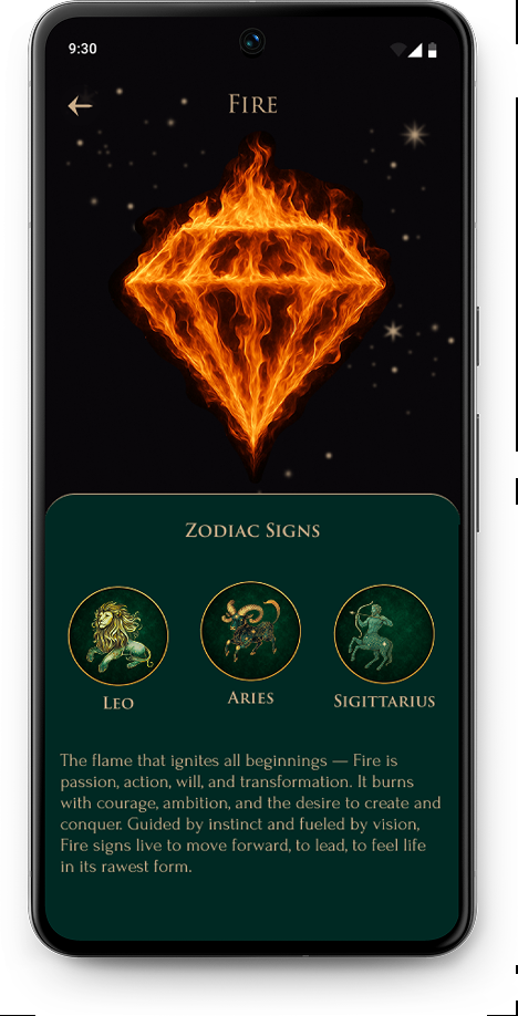
Astrology screen Zodiac signs screen Aries zodiac screen Elements screen Fire element screen

Errors

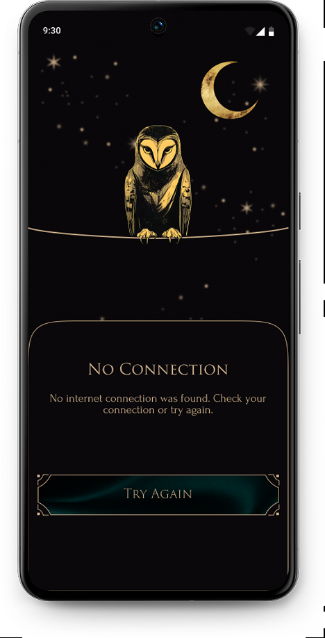
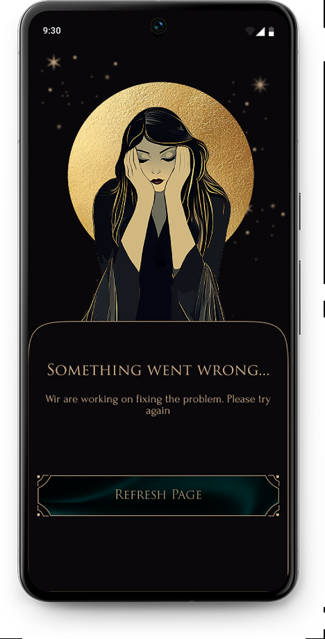
Error states were designed as part of the core experience to support users in moments of frustration or uncertainty.
Each error screen clearly explains what went wrong and offers a single, calm recovery action, while the illustrations help maintain the emotional tone of the product without increasing stress.

No connection error screen Something went wrong error screen

Takeaways

While working on this project as the sole designer in a small development team, I gained a deeper understanding of how crucial clear documentation and idea tracking are throughout the design process.
Even after wireframes are approved, decisions evolve — which makes maintaining an idea journal and clear task records essential for avoiding misunderstandings within the team.
The project has progressed smoothly into the testing phase, reinforcing that high-fidelity design and implementation are not endpoints, but part of an ongoing, iterative process focused on refinement and user feedback.