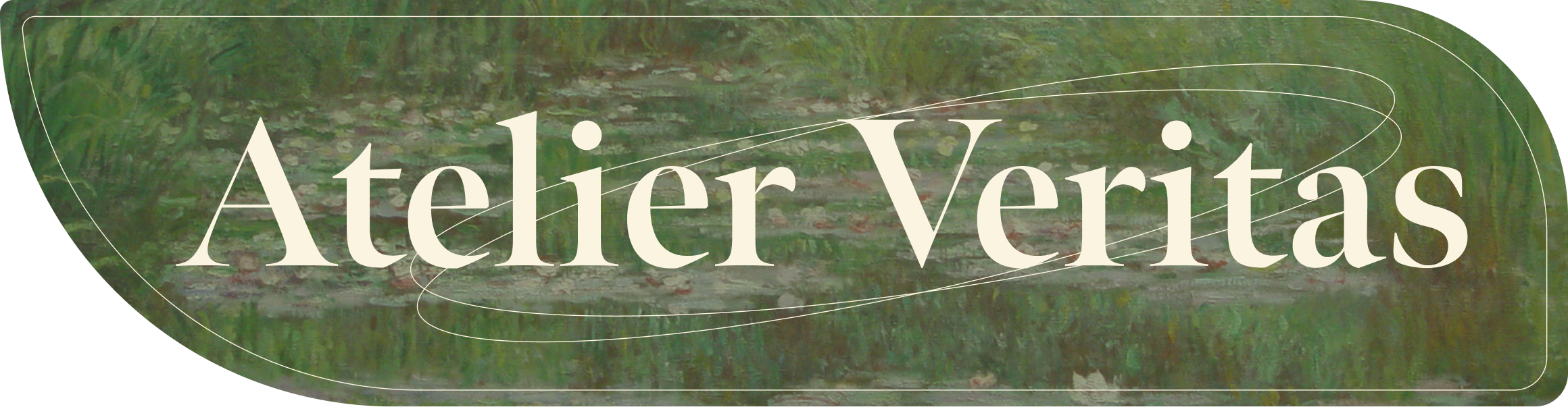
Atelier Veritas

Digital museum experience design

Introduction

This case study is a continuation of my previous project, the ArtPass Application for Museum.
While the app focuses on the mobile experience and visitor flow, this part of the project
covers the redesign of the responsive museum website.

The website required a different visual direction and a distinct color palette to better reflect
the digital gallery context. For this reason, I present it as a separate case study, highlighting
the UX approach, responsive logic, and visual system designed specifically for the web
experience.

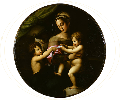
Madonna and Child with the Infant Saint John

Project overview

Audience & Research

I conducted interviews with 6 participants, including casual museum-goers, travelers, and art professionals. From this research, two primary user groups emerged:

  • Art professionals / historians who need structured, detailed information.
  • Casual visitors looking for quick access to tickets, hours, and exhibits.

Key User Insights

Users want fast access to essential information (tickets, hours, prices, maps).
They expect a clean, modern, uncluttered interface.
Professionals need deeper, contextual, high-quality content.

Main Pain Points

Existing museum websites and apps often feel overwhelming or poorly organized.
Critical information is hard to find or buried in long menus.
Navigation is inconsistent and often confusing.

The problem

The museum has no responsive website, making it difficult for visitors to book tickets, check schedules, browse exhibitions, or access reliable, up-to-date information.

The goal

To design a responsive, user-friendly website that adapts to any device and provides clear access to exhibitions, collections, artworks, events, ticketing, and visitor information.

Sitemap

To define the website’s information architecture, I structured all content into a clear hierarchical sitemap. The goal was to reduce cognitive load, ensure predictable navigation patterns, and make key visitor actions—such as ticketing, planning a visit, or browsing exhibitions—accessible within 1–2 interactions.

Hierarchical sitemap for the Atelier Veritas museum website

The sitemap was built based on user interview insights and content audits. I prioritized:
  • Findability (fast access to essential visitor information)
  • Scannability (clear grouping of related content)
  • Predictable navigation (consistent patterns across desktop and mobile)
  • Shallow hierarchy (most content accessible within 2 levels)

This helped eliminate the primary pain points discovered during research: overwhelming menus, unclear grouping, and difficulty locating ticketing and hours information.

Wireframes & Early Explorations

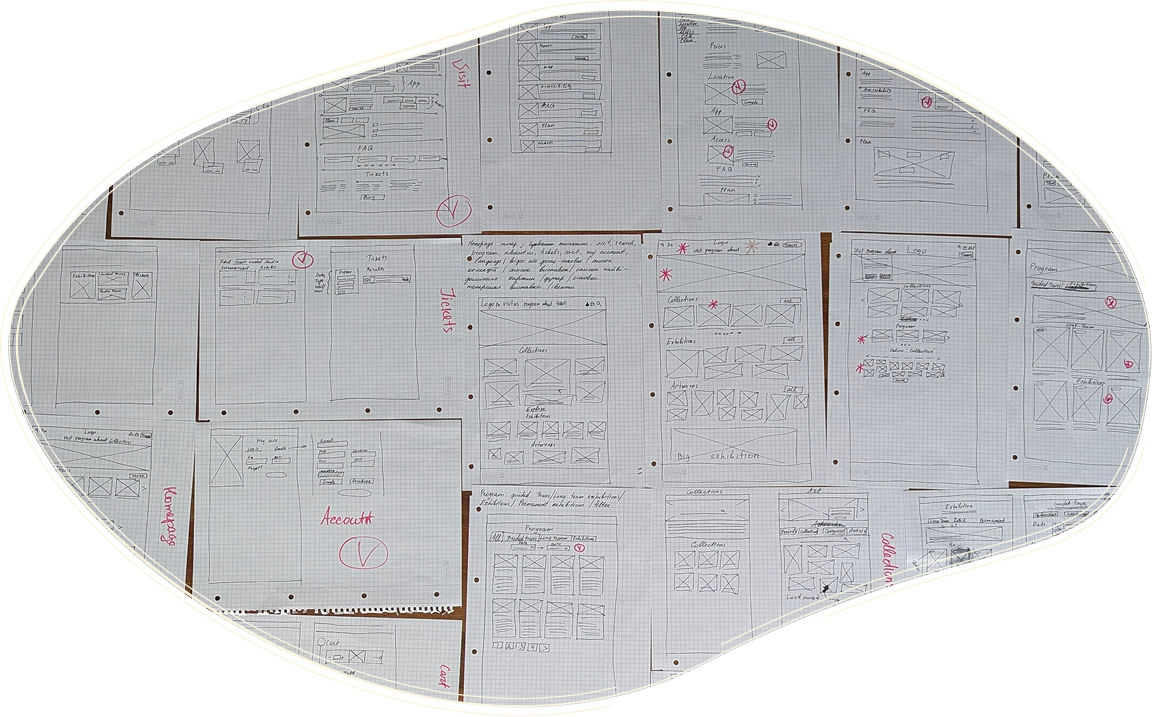
Paper Wireframes / Desktop

Before moving to Figma, I created multiple paper wireframe variations for the key pages of the website.
This helped me quickly explore different layout structures, validate content hierarchy, and identify which components needed prominence on both desktop and mobile.

I focused on:

  • establishing a clear visual hierarchy
  • defining how users access essential information (tickets, exhibitions, collections)
  • testing alternative navigation patterns
  • evaluating how content density changes across breakpoints

This early exploration allowed me to eliminate ineffective layouts and move into digital wireframes with a clearer direction.

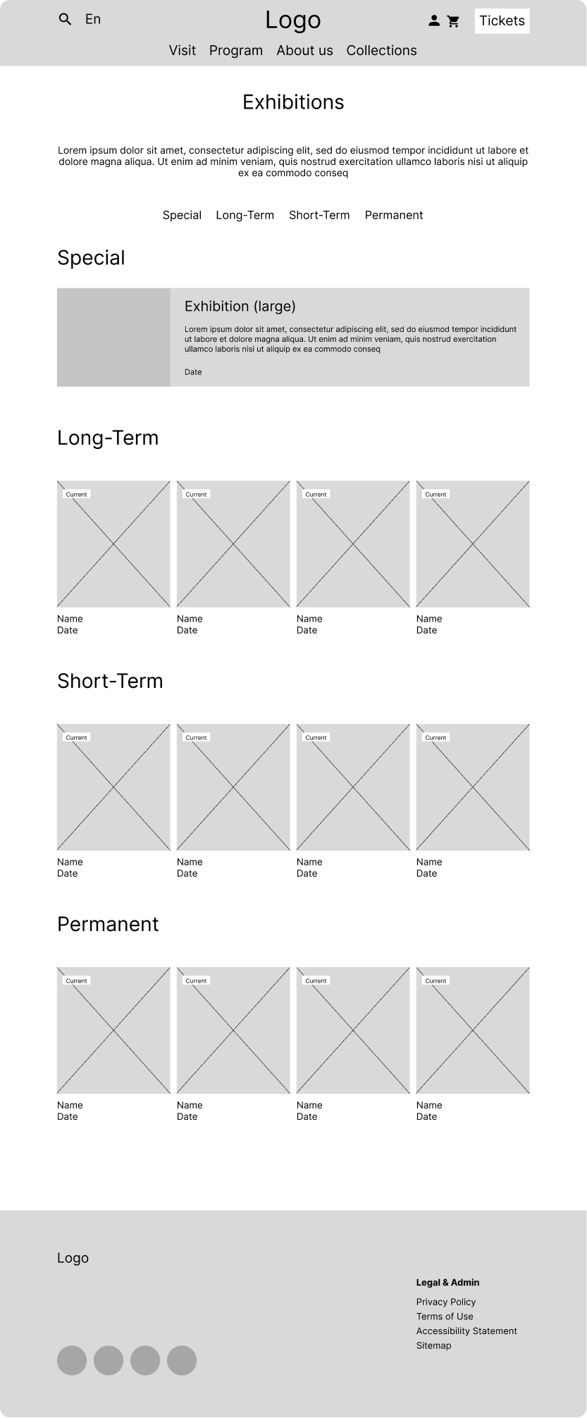
Desktop website paper wireframes

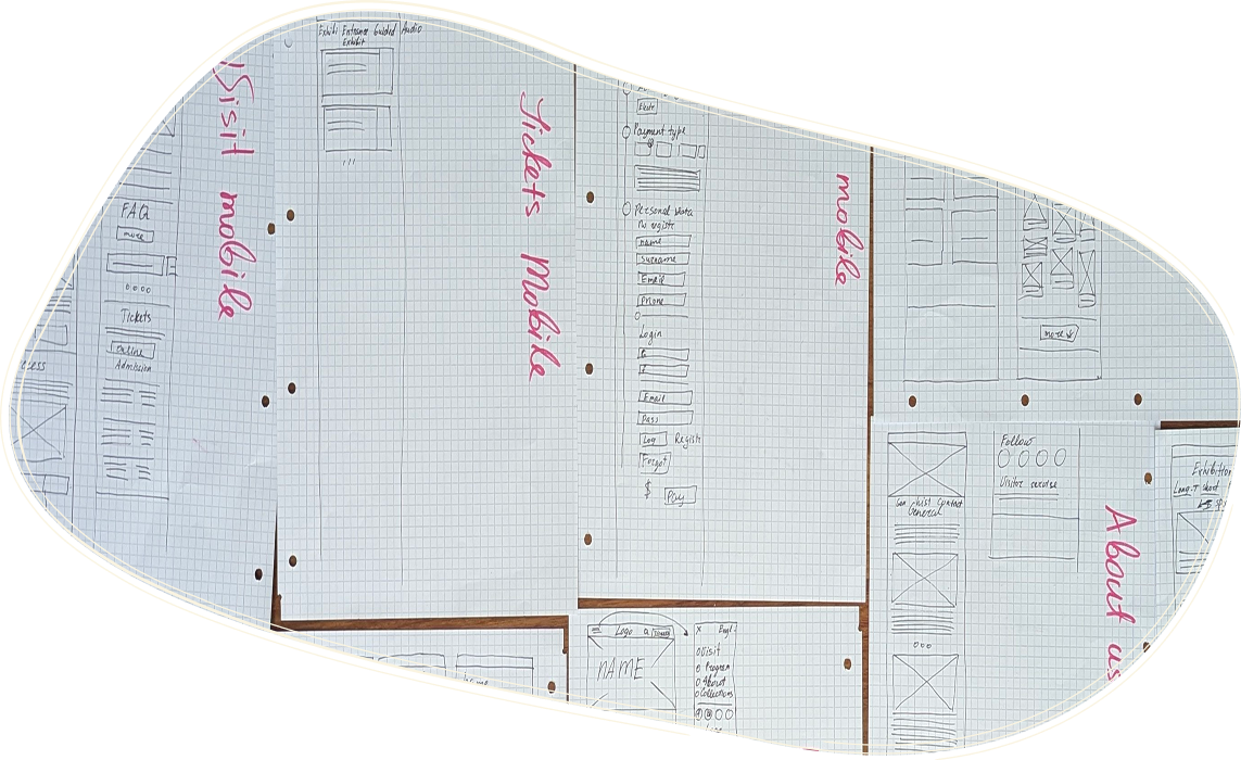
Paper Wireframes / Mobile

I also sketched simplified versions for mobile to test how the structure would scale down.
The priority was to ensure that users could access ticketing and exhibition content within one or two interactions, even on smaller screens.

Mobile website paper wireframes

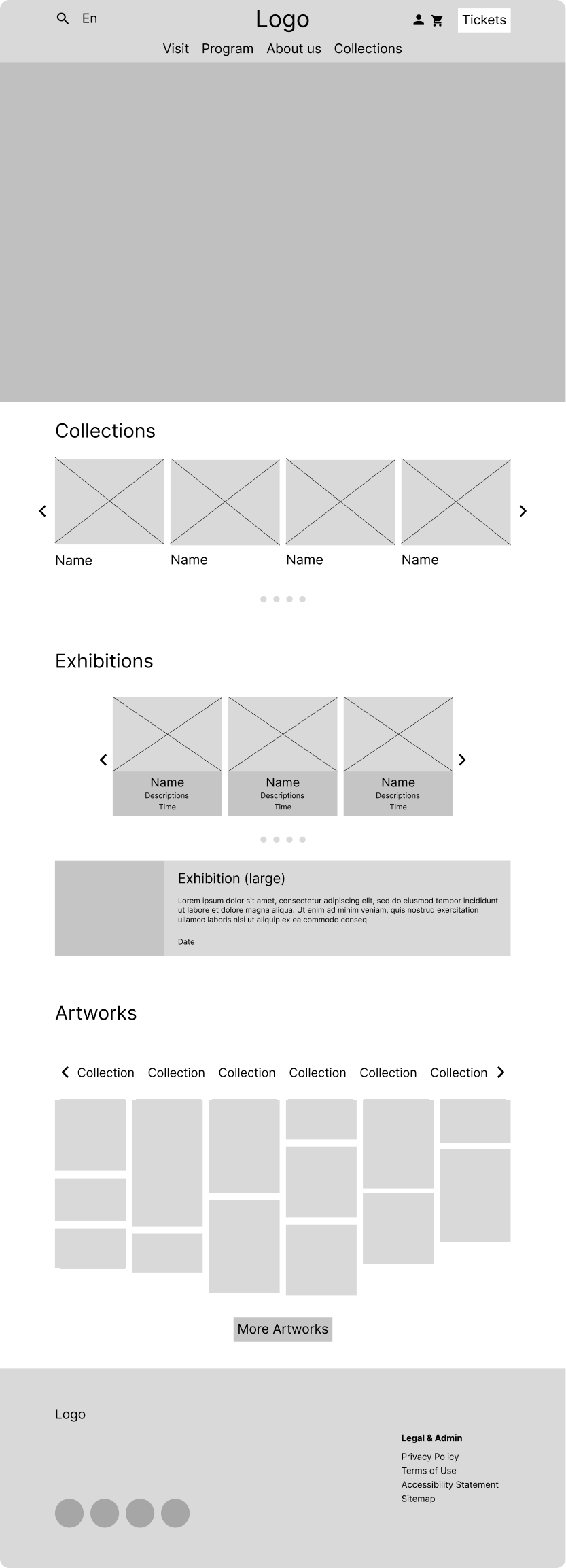
Digital Wireframes

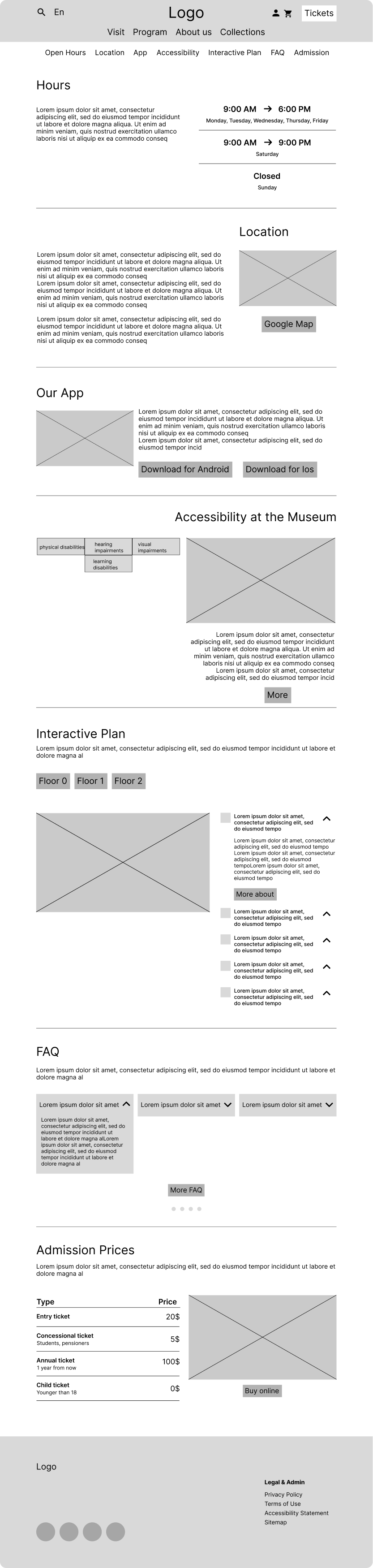
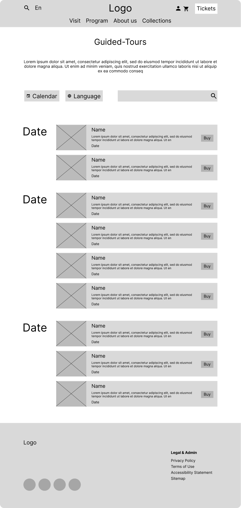
The digital wireframes helped me validate the information architecture and test how key content blocks behave across different screen sizes.

At this stage, I focused on:

  • establishing a clear hierarchy for exhibitions, collections, and artworks
  • simplifying the ticketing flow to minimize cognitive load
  • testing alternative navigation patterns for mobile
  • ensuring that essential visitor information (hours, prices, location, accessibility) remains easily accessible

These wireframes served as the foundation for defining the layout structure, refining content placement, and preparing for the responsive design stage.

High-Fidelity Design

Typography System

For the primary typeface, I selected Meno Banner, a serif font by Robert Slimbach. Its refined proportions and high contrast align well with the visual language of classical art institutions.

The typeface supports the design goals by:

  • reinforcing the museum’s cultural identity
  • improving readability in long-form editorial content
  • creating strong visual hierarchy for headings
  • providing a timeless and authoritative tone

This serif type was paired with a clean sans-serif family for UI elements to ensure clarity and optimal legibility across devices.

Atelier Veritas typography presentation using Meno Banner

Color System

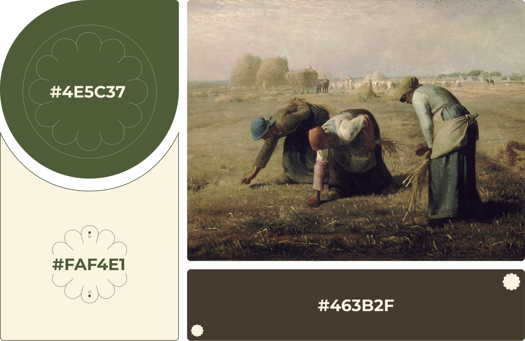
The color palette is inspired by classical art and was designed to support both the brand identity and the usability of the interface.

The palette consists of:

  • Primary color — a warm neutral tone used for surfaces and backgrounds, providing a calm, museum-like atmosphere without distracting from artwork.
  • Secondary colors — an olive tone and a deep brown that help establish visual hierarchy and support section-level structuring.

All colors were tested for contrast and accessibility to ensure readability across both light and dark backgrounds.

Atelier Veritas color system with cream, olive, and deep brown palette

Components

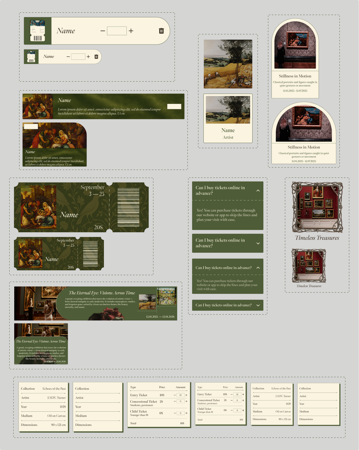
The component library was designed to support a consistent and scalable UI across both desktop and mobile. Each component follows the same visual principles: clear hierarchy, reduced ornamentation, and high legibility inspired by classical editorial layouts.
The system includes:

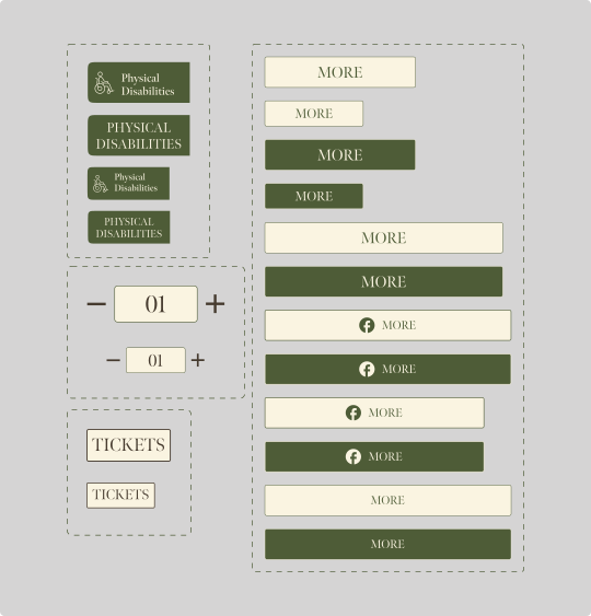
  • Buttons in three sizes and two color variations, ensuring clear affordance for primary and secondary actions.
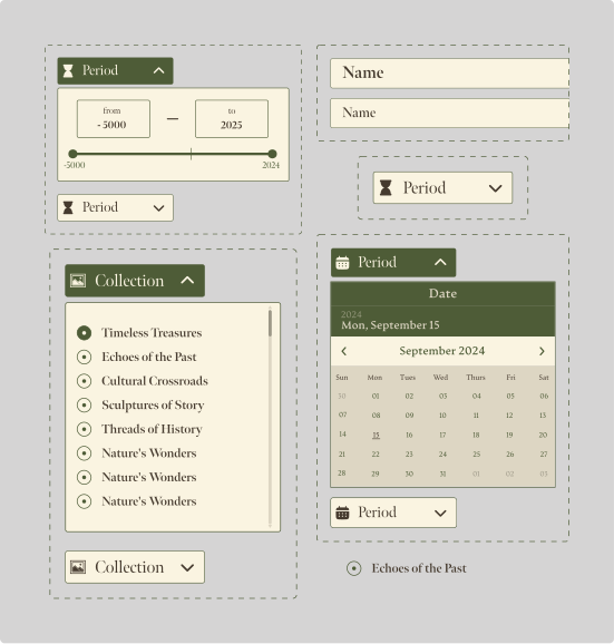
  • Inputs and dropdowns structured for clarity and accessibility, with large tap areas and consistent spacing.
  • Cards for artworks, exhibitions, and events, optimized for readability and image-forward layouts.
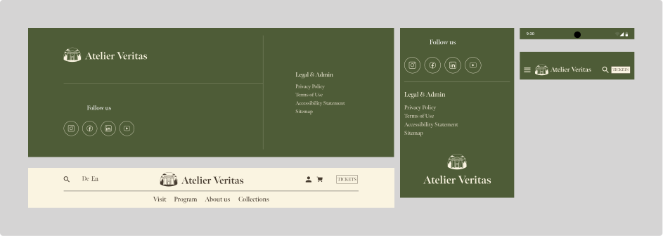
  • Navigation patterns that maintain simplicity while supporting deep information architecture.
  • Icons based on a clean, minimal style to contrast the more expressive typography.

All components were tested across multiple breakpoints to ensure proper scaling and visual balance.

Final Design

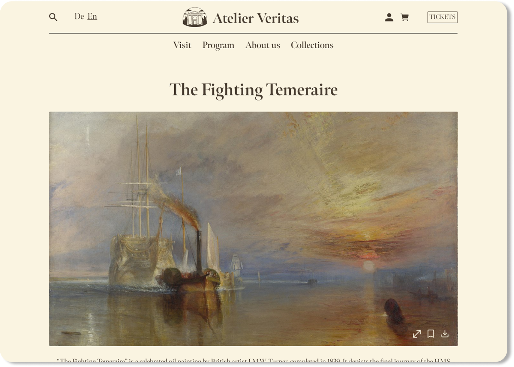
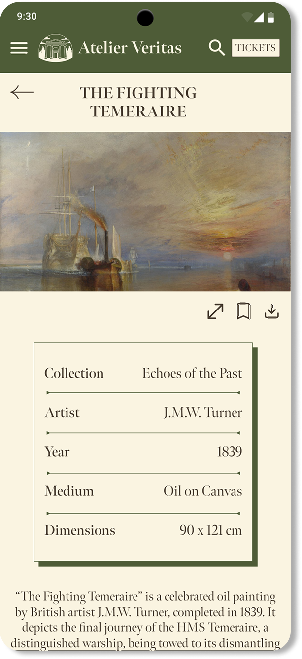
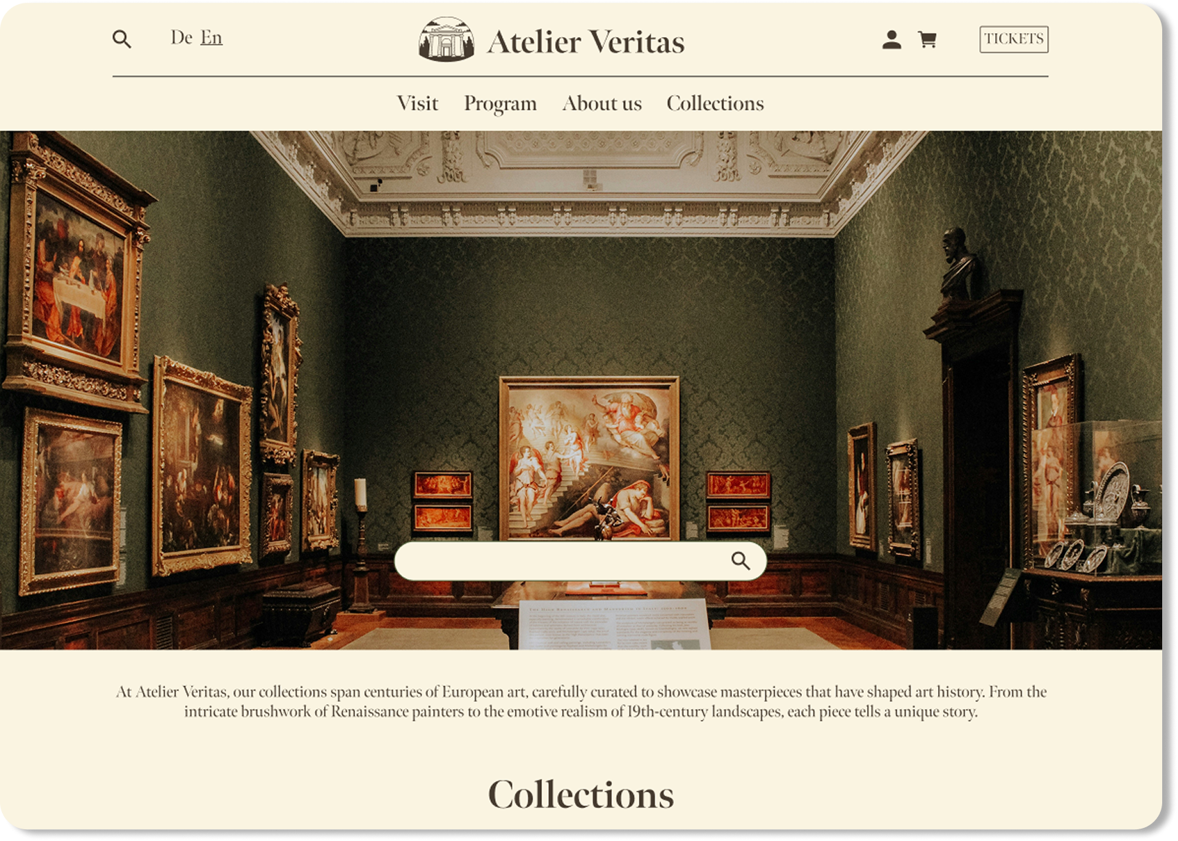
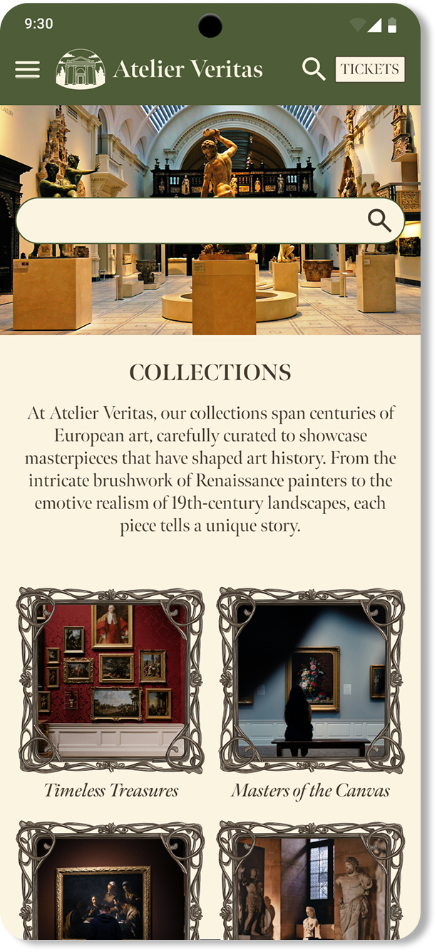
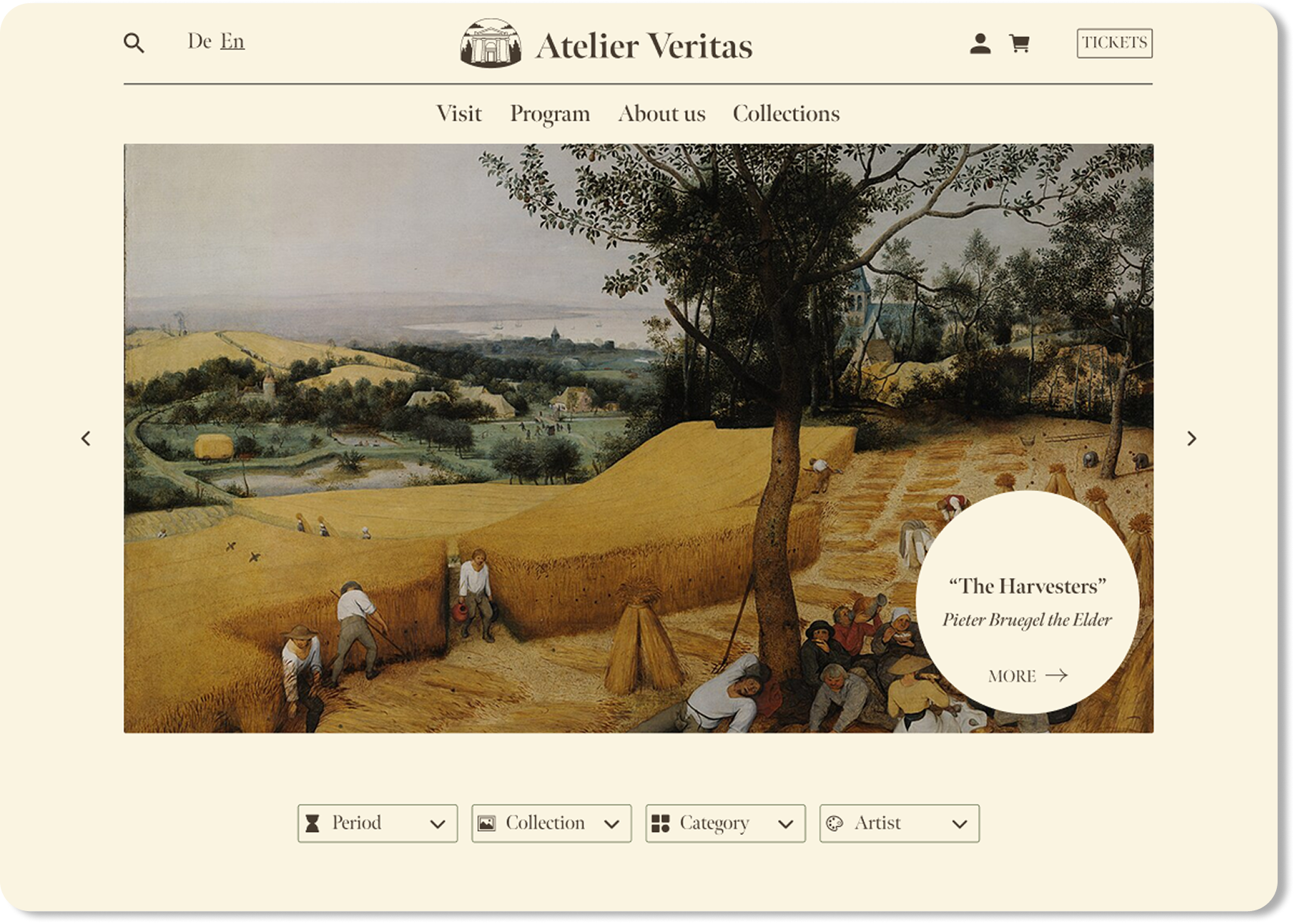
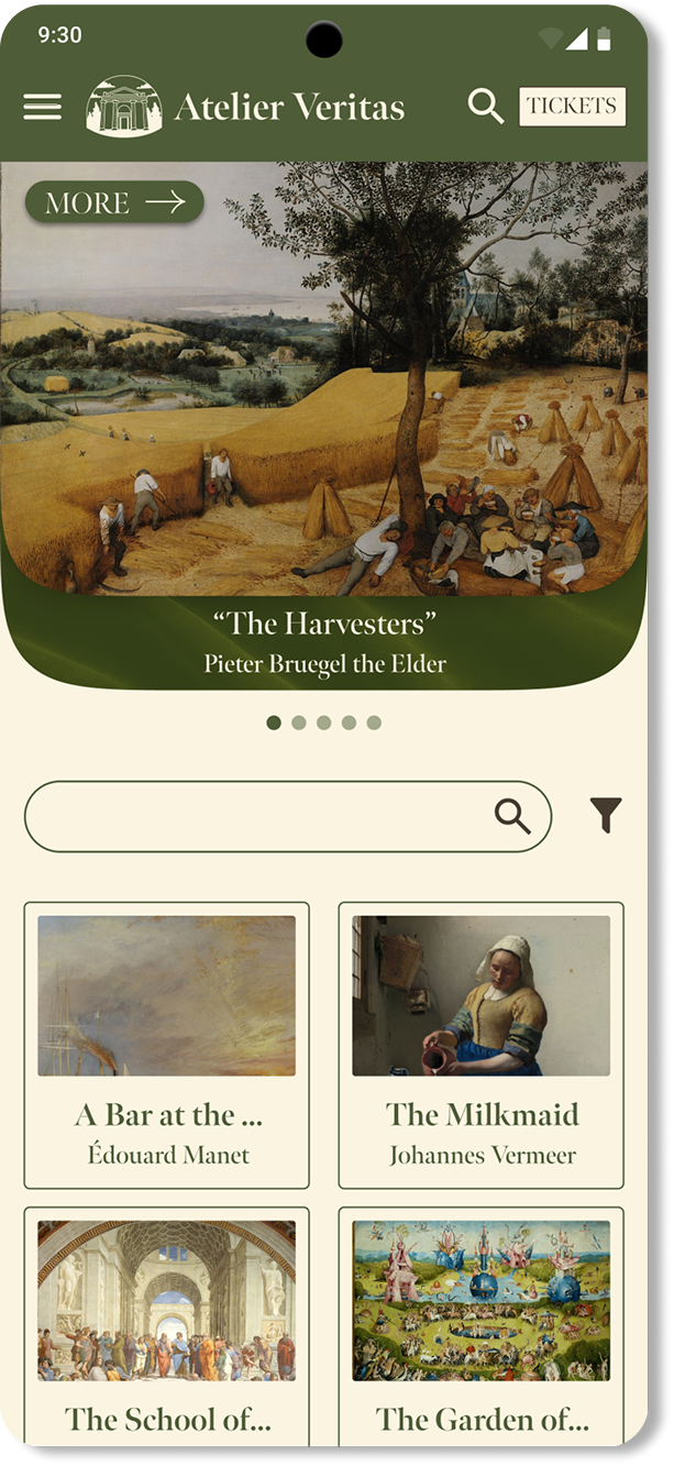
Browsing artwork is central to the museum experience. These layouts were designed to support both discovery and deep exploration, adapting content to each screen size.

Artwork page final design on desktop Artwork page final design on mobile
Collections page final design on desktop Collections page final design on mobile
Collection page final design on desktop Collection page final design on mobile
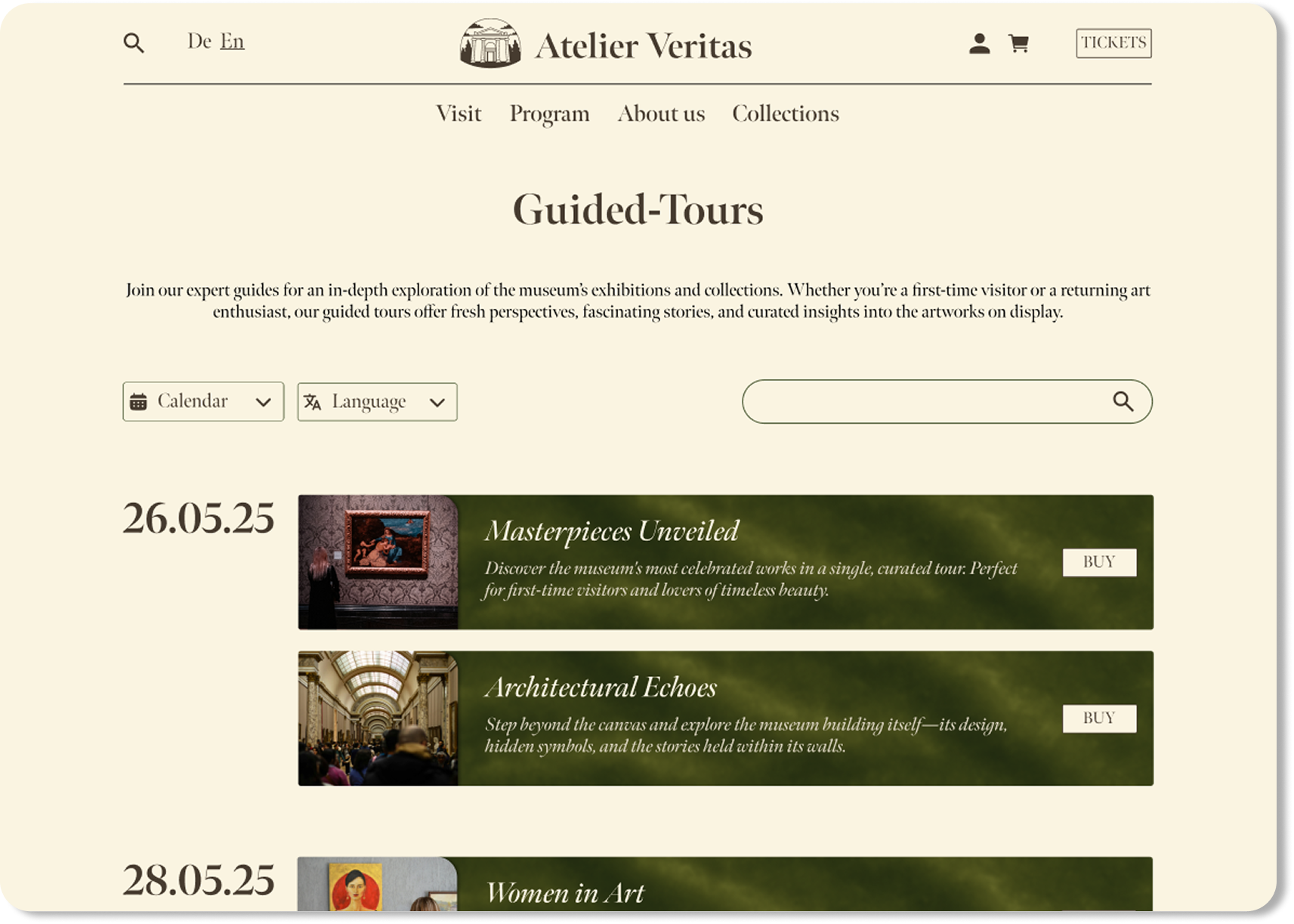
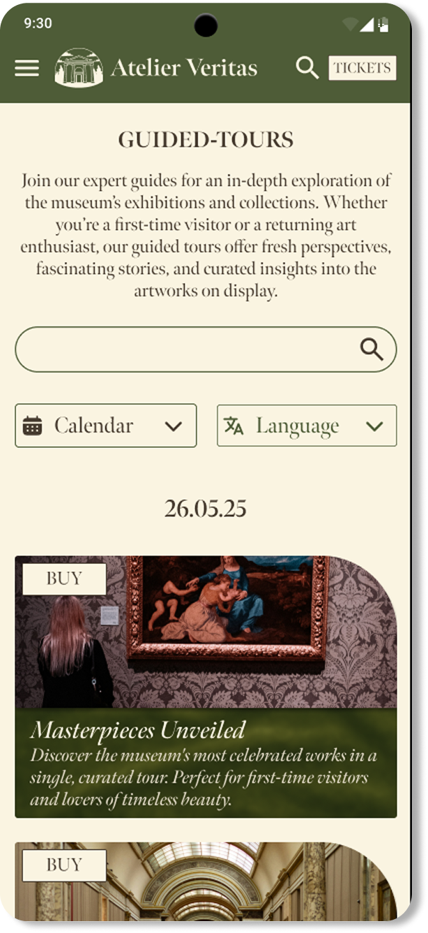
Guided tours page final design on desktop Guided tours page final design on mobile
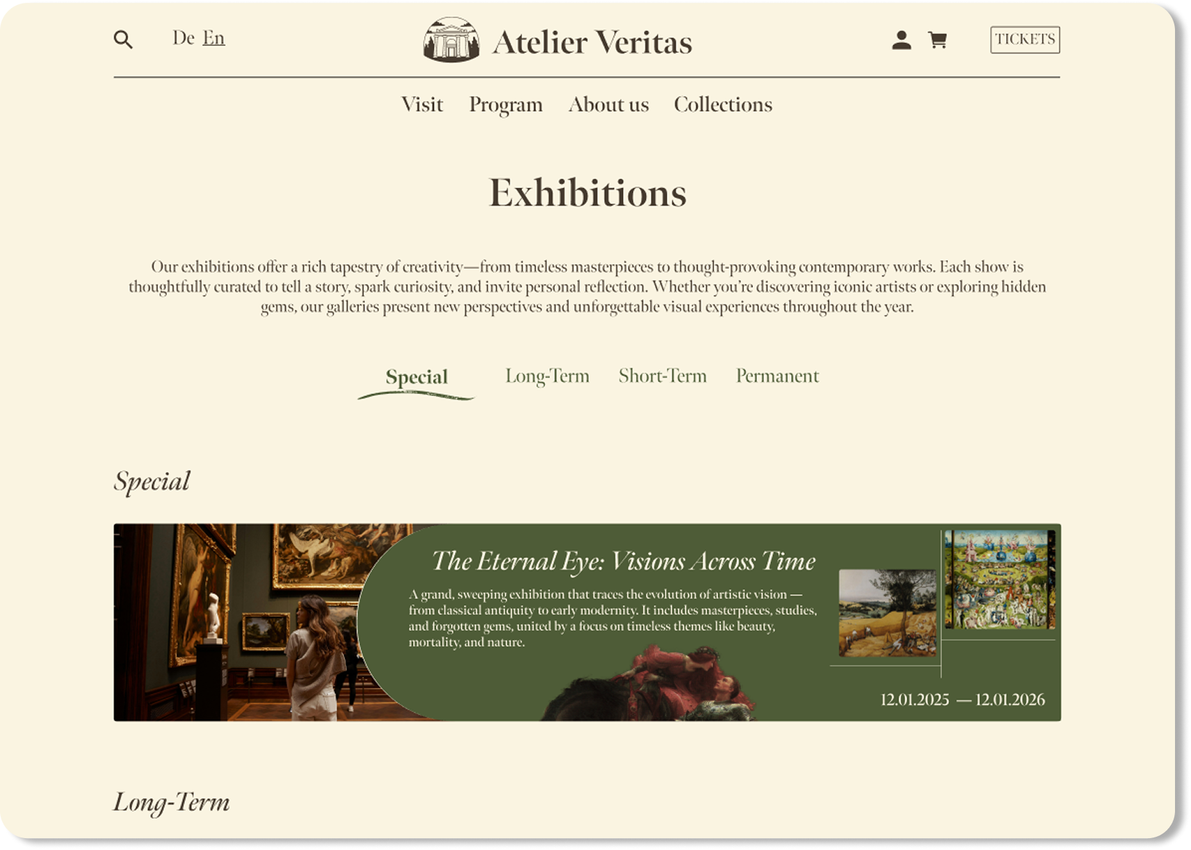
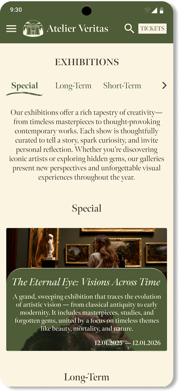
Exhibitions page final design on desktop Exhibitions page final design on mobile

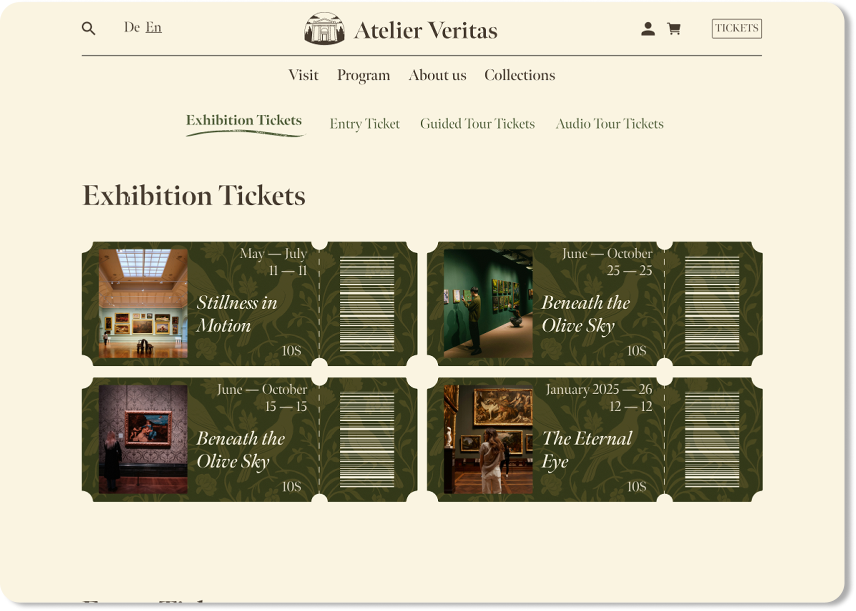
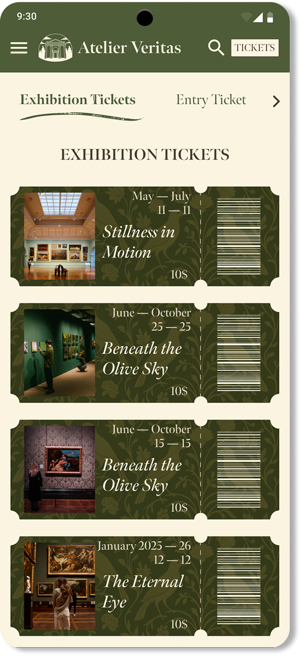
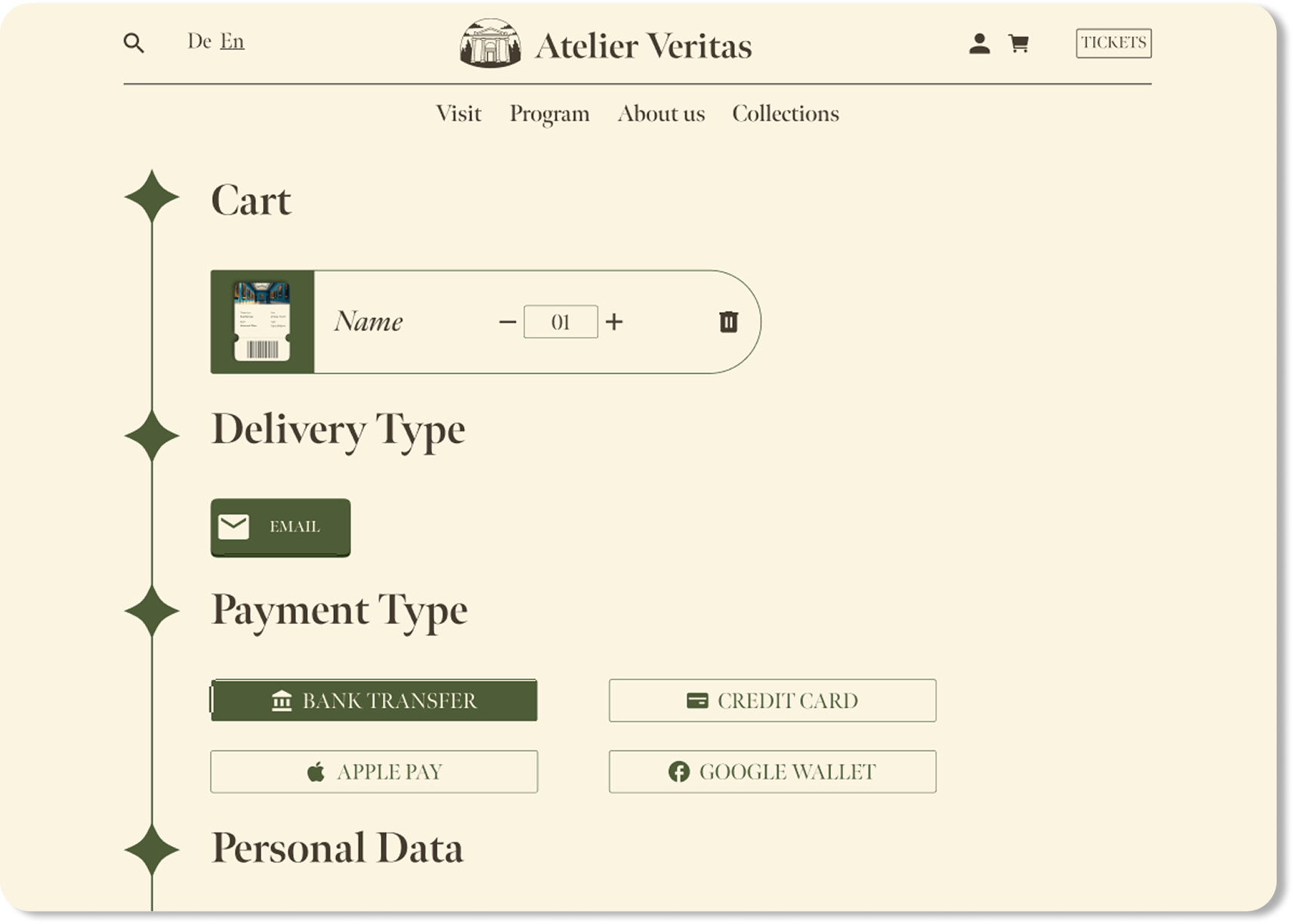
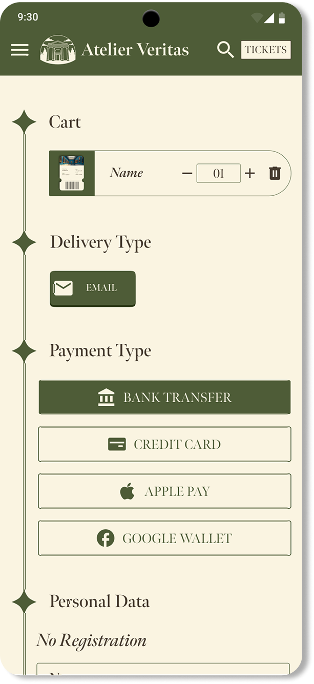
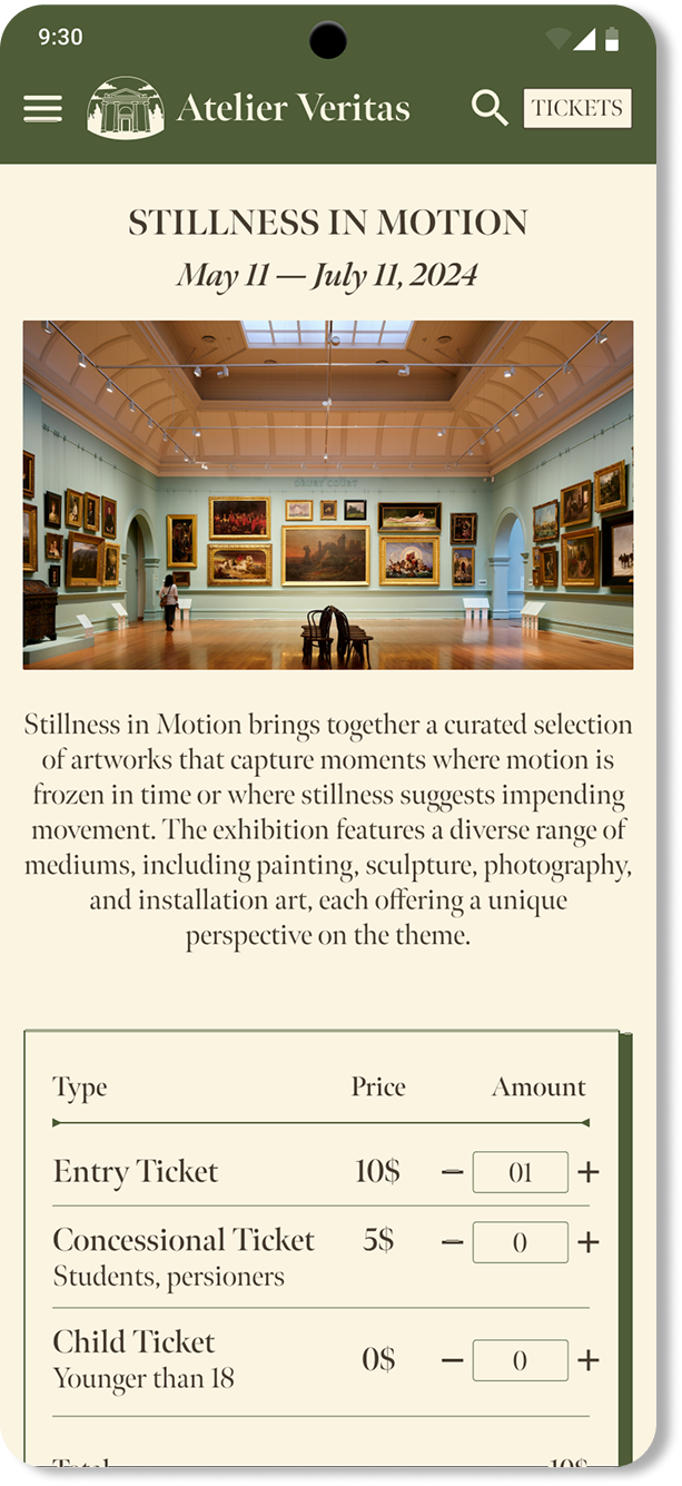
The booking flow was optimized for clarity and ease. Attention was given to reducing visual clutter on mobile while keeping actions prominent.

Exhibition ticket booking final design on desktop Exhibition ticket booking final design on mobile
Cart final design on desktop Cart final design on mobile
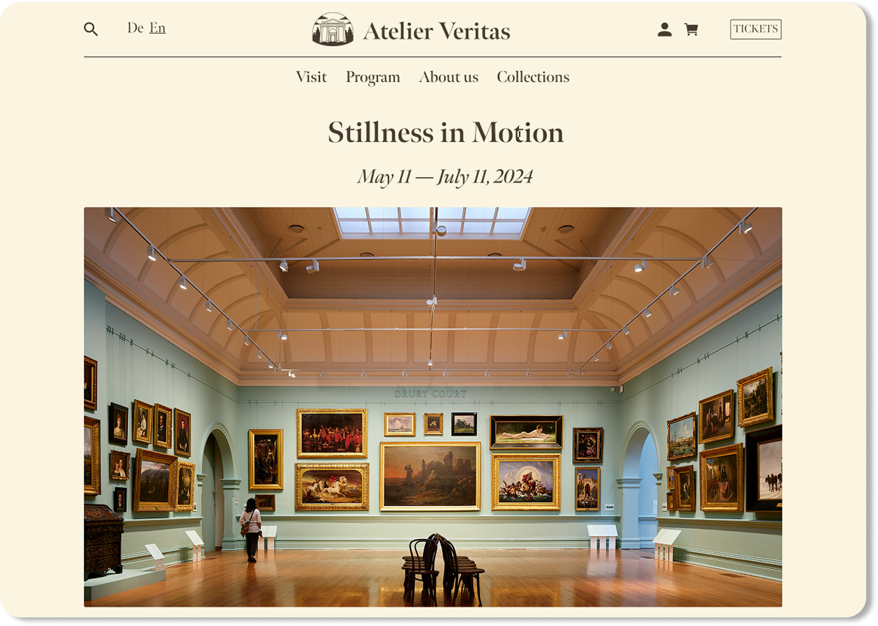
Exhibition details final design on desktop Exhibition details final design on mobile

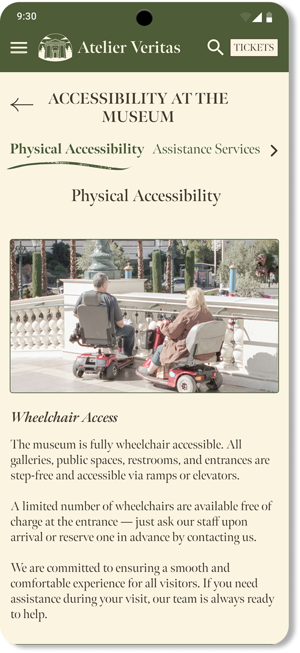
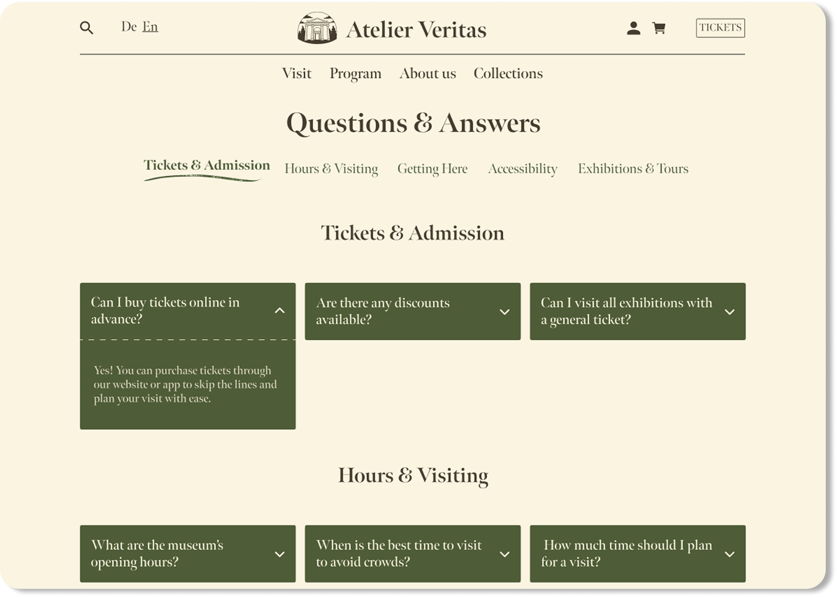
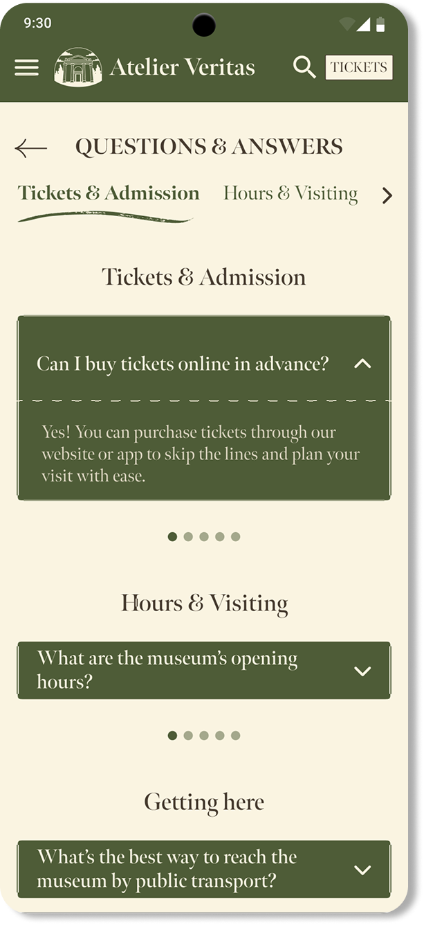
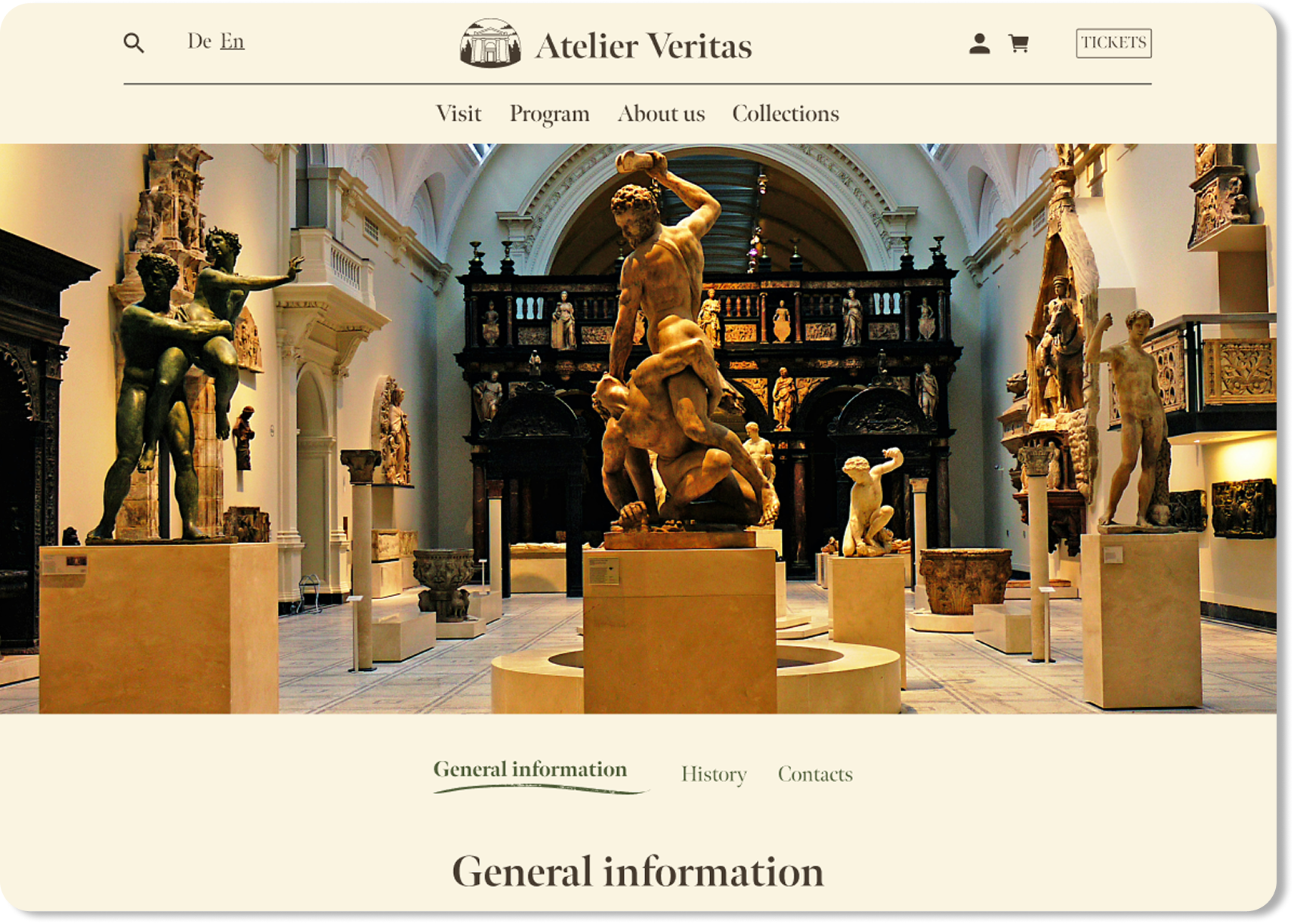
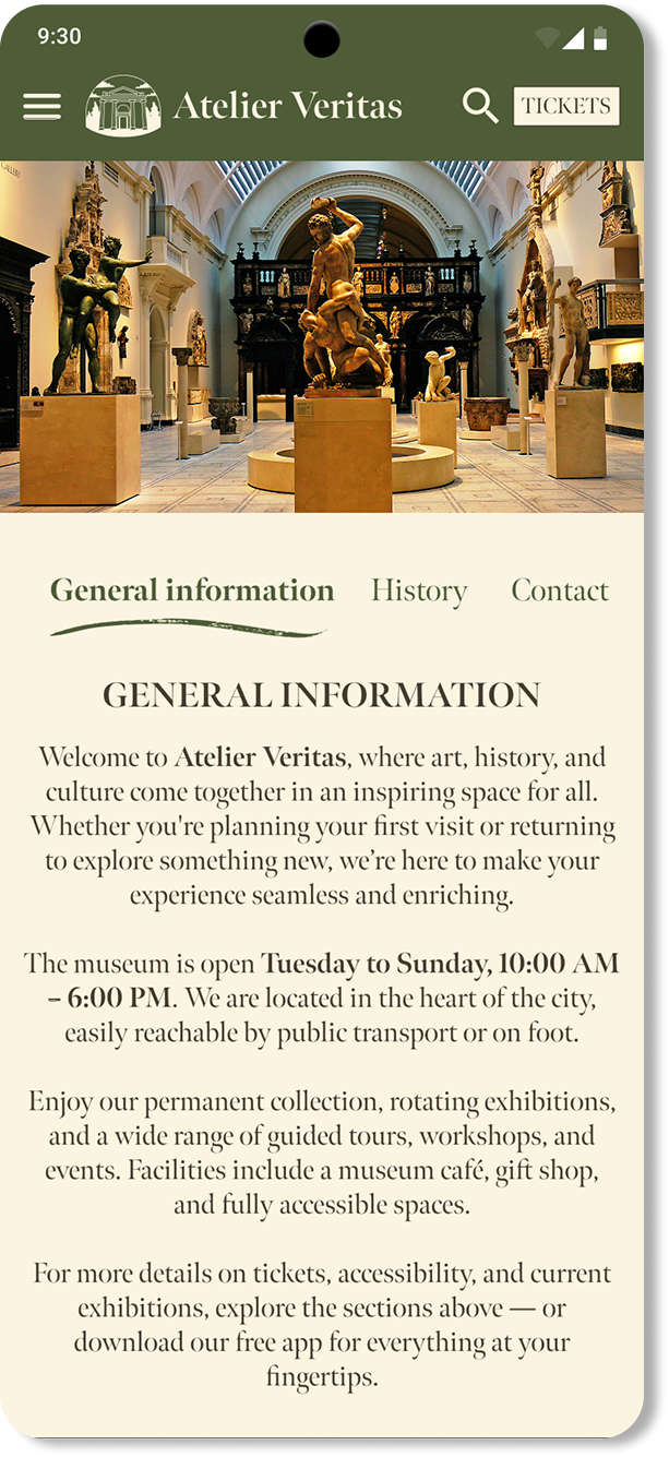
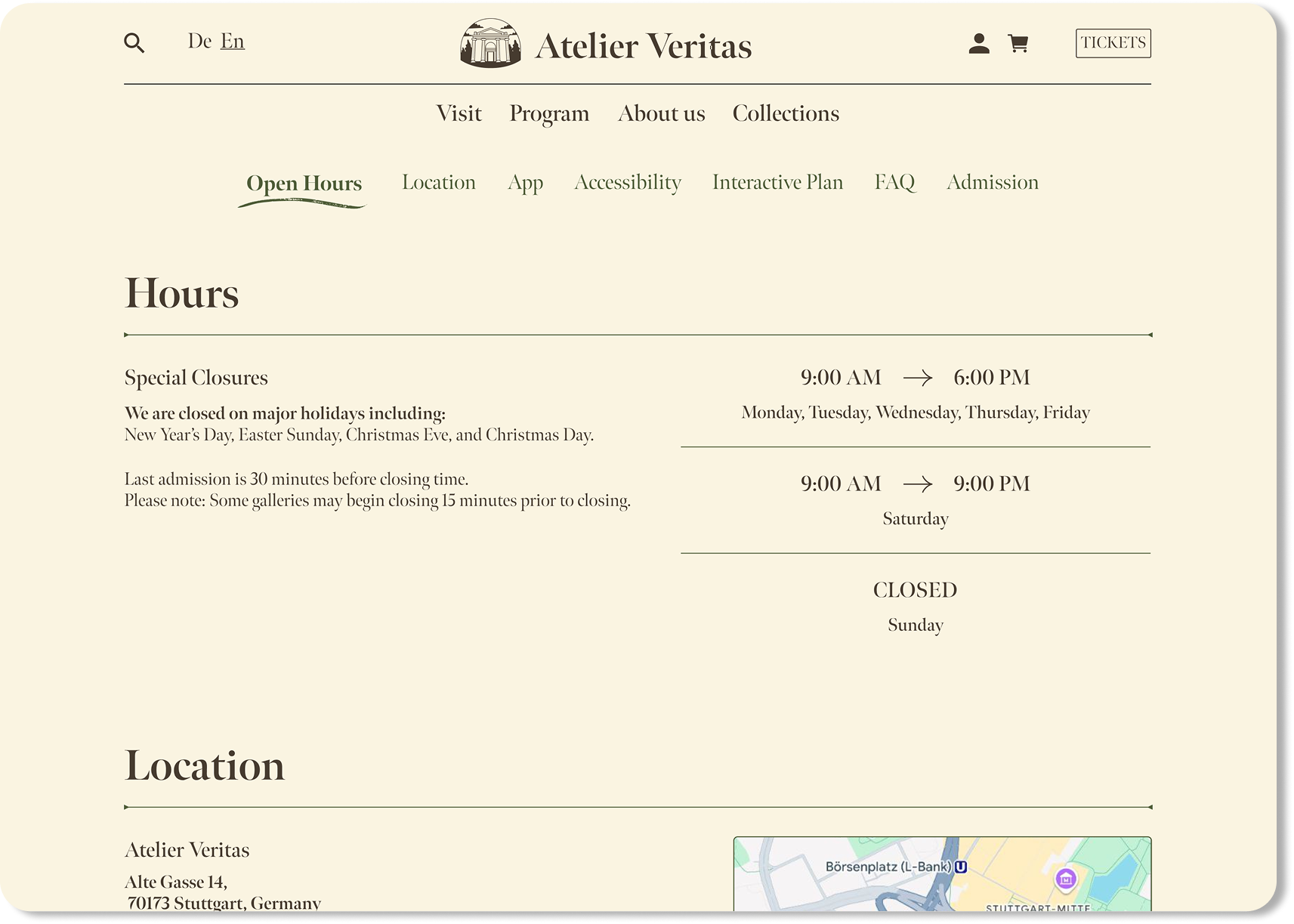
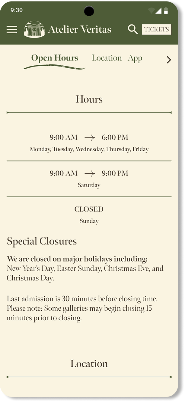
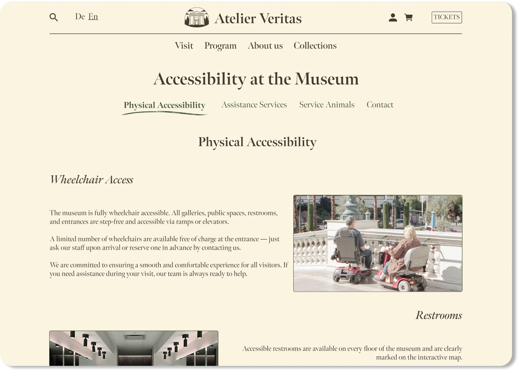
These screens help users plan their visit with confidence, offering quick access to essential information like opening hours, location, and accessibility.

Visit information final design on desktop Visit information final design on mobile
Accessibility page final design on desktop Accessibility page final design on mobile
Questions and answers final design on desktop Questions and answers final design on mobile
General information final design on desktop General information final design on mobile

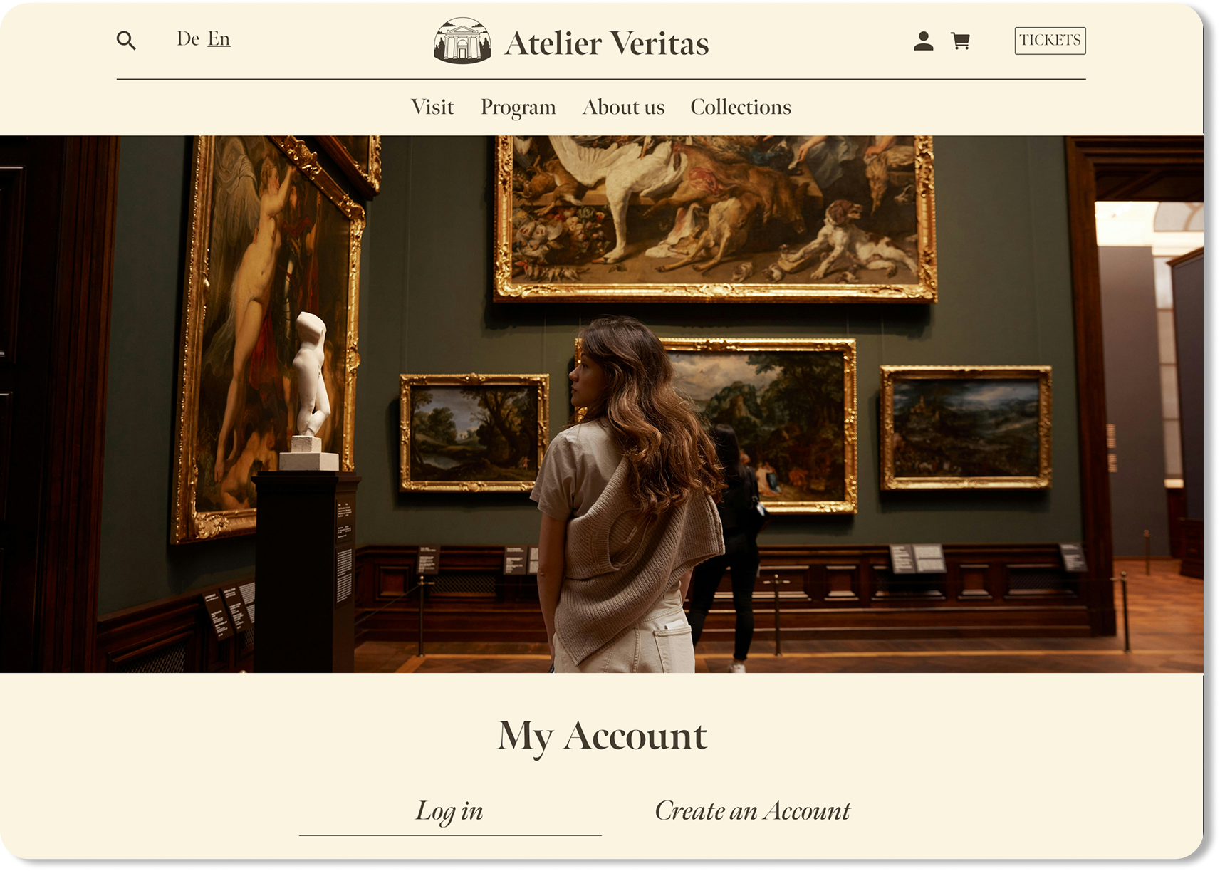
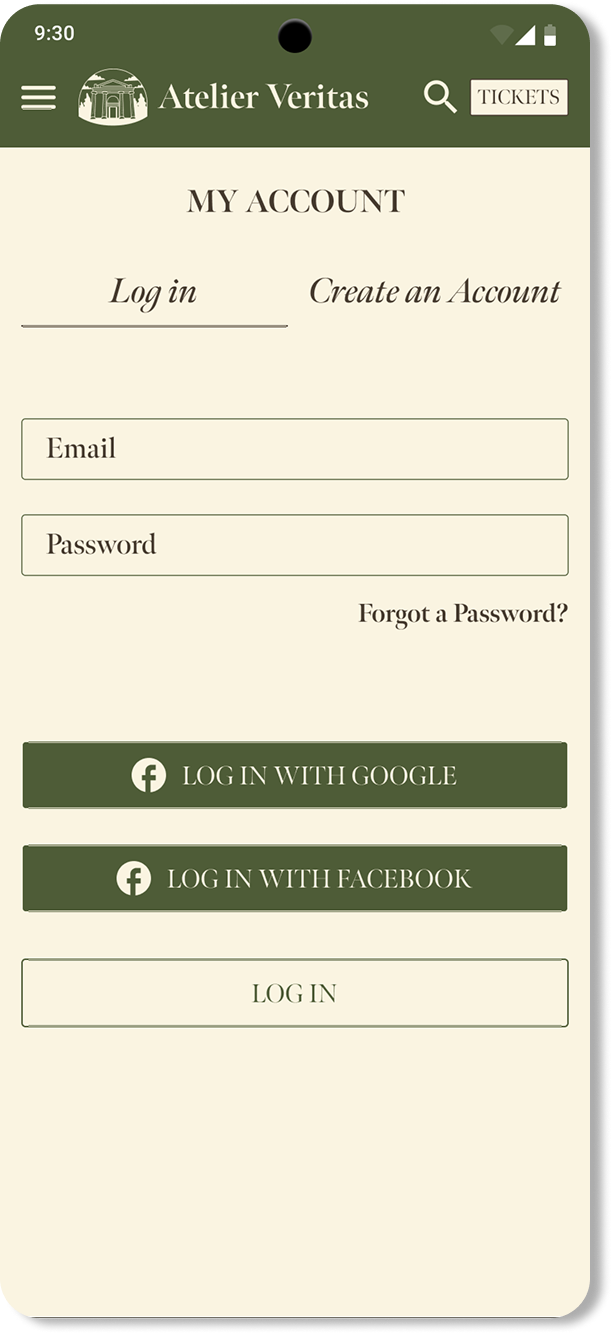
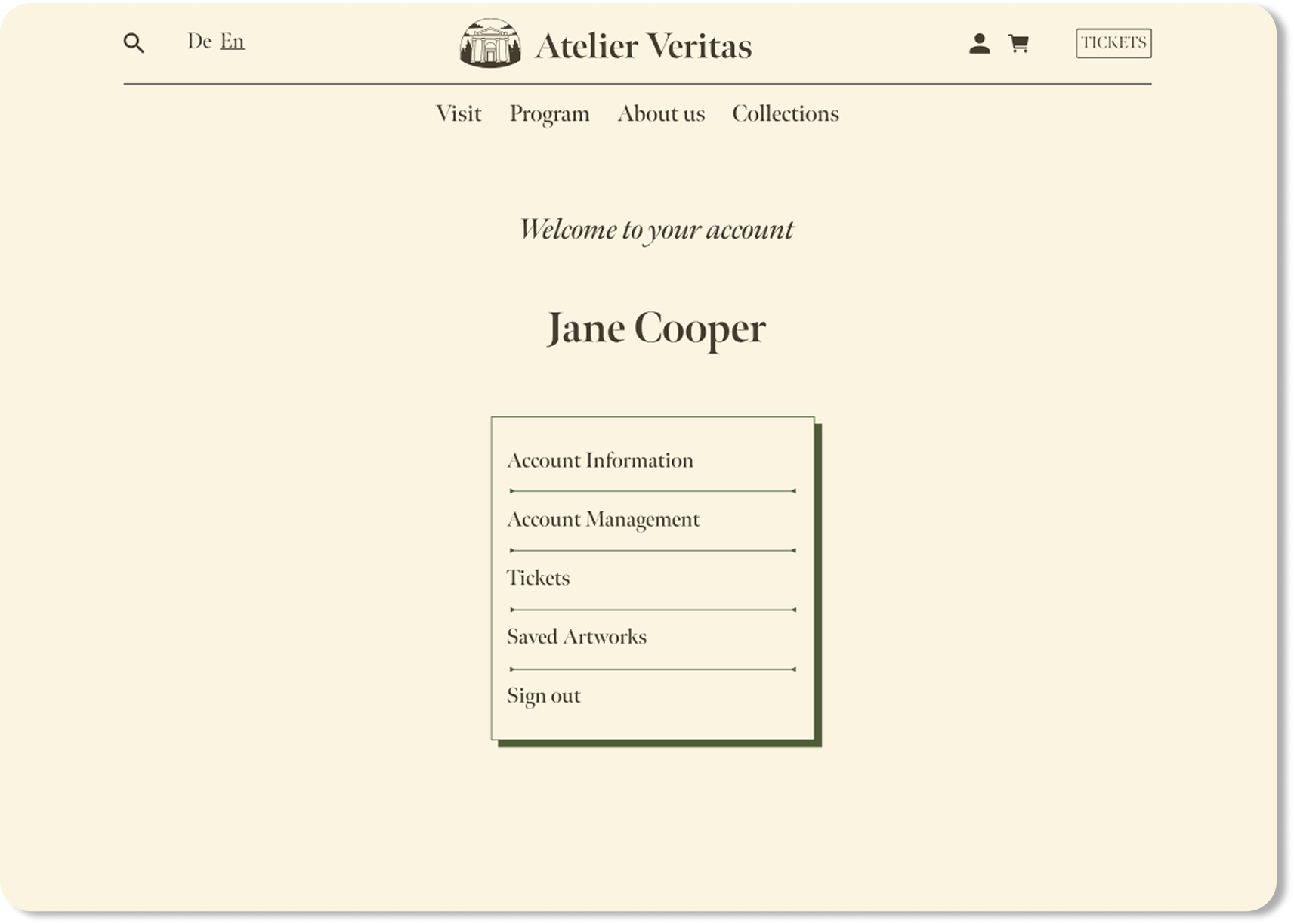
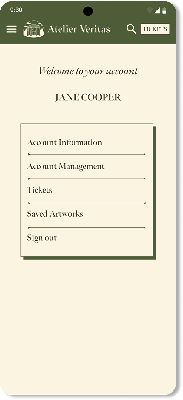
Account access is designed to feel private, personal, and easy to use — with a smooth login experience across all devices.

My Account final design on desktop My Account final design on mobile
Existing account login final design on desktop Existing account login final design on mobile