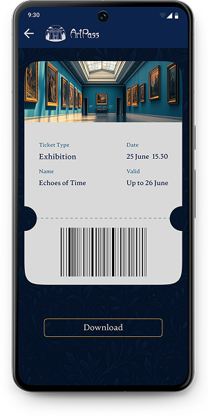
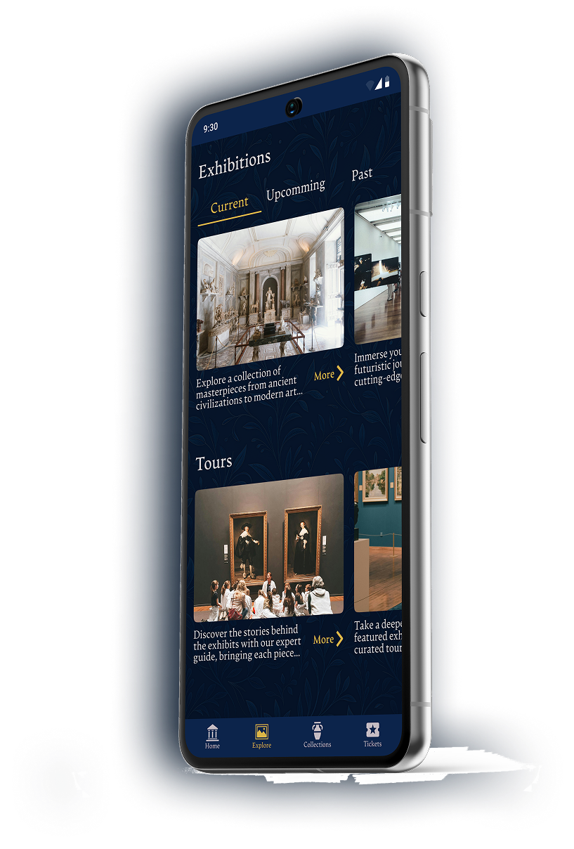
ARTPASS

A museum discovery & exhibition
companion app

Role: UX/UI Designer

Timeline: Aug 2024 — Feb 2025

Scope: Research, UX, UI, Design System, Prototyping

Objective

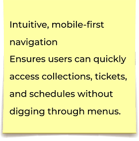
Design a museum app that serves both casual visitors and art enthusiasts. Research showed that existing museum apps suffer from poor usability, outdated design, and limited content.

The goal was to create an intuitive experience with layered content — quick insights for general visitors and in-depth knowledge for those seeking more.

Challenges

Most museum apps are either too complex for casual users or too shallow for art professionals. Casual visitors struggle with cluttered interfaces and outdated layouts, while experts lack access to detailed, reliable information.

This results in low engagement and minimal use beyond basic tasks like purchasing tickets.

Research

  • User interviews
  • Personas & journeys
  • Key pain points

Defining

  • Problem Statement
  • Value Proposition

Ideation

  • How might we questions
  • Concept exploration
  • Rapid Sketching

Design &
Validation

  • Information architecture
  • User flows
  • Wireframes
  • Prototyping
  • Usability testing
  • High-fidelity design

User Research

Interviews

I conducted semi-structured interviews with six participants, ranging from casual museum visitors to people with an academic background in art history.

The goal was to understand how different audiences interact with existing museum apps, what information they miss, and how much depth they expect from digital experiences.

I only use
museum apps
to buy tickets —
everything else
is too messy.
I’d love more
professional
descriptions, but
only when I choose to
dive deeper.

Research Insights

  • Poor mobile optimization — users often avoid museum apps because interfaces feel outdated or difficult to use on smaller screens.
  • Low engagement — most participants open apps only to buy tickets or check basic info, not to explore content.
  • Different expectations — art professionals want deeper descriptions, while casual visitors prefer short, simple summaries.
  • Overload problem — users feel overwhelmed when apps present long texts without hierarchy or visual aid.

Empathy Map

I decided to create an empathy map based on the interviews I conducted earlier. After that, I combined all the individual empathy maps into an aggregated empathy map. Below is a brief version of the insights I gathered.

Says

  • “I want quick access to opening hours, tickets, and current exhibitions.”
  • “I wish there was clearer, more professional information about the artworks.”
  • “Most museum websites feel outdated and cluttered.”
  • “Mobile versions are often poorly optimized or inconvenient to use.”

Does

  • Primarily uses museum websites to check schedules, locations, and ticket prices.
  • Often buys tickets on-site due to confusing or inconvenient online booking.
  • Rarely uses museum apps, they feel impractical or too basic.
  • Visits major museums (Louvre, Albertina, MoMA, NHMU, etc.) and uses external ticketing platforms.

Thinks

  • The content should match the museum’s identity: professional, calm, and visually clear.
  • Simple navigation is more important than decorative or experimental UI.
  • The mobile experience must be primary, not an afterthought.
  • The ideal app should support both casual visitors and users who seek deeper knowledge.

Feels

  • Frustrated by hidden prices, complicated flows, and overloaded interfaces.
  • Overwhelmed by excessive content or poor layout.
  • Disappointed when artwork descriptions lack depth.
  • Trusts official museum platforms more than third-party services.

This aggregated empathy map highlighted the gap between casual visitors and users seeking expert-level content. This insight informed the decision to use layered content (quick facts → detailed information) and prioritize a clean, mobile-first experience. It also emphasized the importance of simplifying ticket flows and improving content clarity.

Pain Points

1

Essential information is difficult to find

Disorganized collection lists and unclear navigation make it hard for users to quickly locate opening hours, ticket prices, or exhibition details.

2

Insufficient depth for knowledgeable users

Art professionals and enthusiasts often lack access to detailed descriptions, contextual information, and expert-level insights about artworks and collections.

3

Poor mobile usability

Many museum sites and apps are not optimized for mobile, resulting in friction: small touch targets, confusing layouts, and slow performance.

4

Overwhelming or irrelevant content

Users frequently encounter cluttered layouts, excessive text, or promotional content, which distracts from the core goal of exploring art.

Meet the Users

Élise Laurent

Élise Laurent

Age:

Education:

Hometown:

Family:

Occupation:

24

Bachelor degree

Paris, France

In relationship

SMM Specialist

Goals
  • Quickly access museum information (hours, tickets, exhibitions) without digging through pages
  • Explore collections in a simple, calm, visually pleasing way
  • Receive concise summaries instead of long academic descriptions
Frustrations
  • Mobile websites feel cluttered and non-optimized
  • Too much irrelevant or promotional content
  • Difficult to understand museum routes and where to start

Lorenzo Moretti

Lorenzo Moretti

Age:

Education:

Hometown:

Family:

Occupation:

28

Bachelor degree

Bologna, Italy

Single

Art Teacher

Goals
  • Access detailed and credible information about artworks
  • Receive curated recommendations and exhibition updates
  • See both simple and expert-level content depending on the context
Frustrations
  • Existing apps focus too much on general public content, not experts
  • Hard to find ticket info without distractions
  • Frequent ads and pop-ups disrupt the experience
I visit museums often, but it’s frustrating how hard it is to find reliable information about collections and artworks before I go.

User Journey Map

To better understand how different user types interact with museum applications over time, I mapped out the key stages of their journey - from discovering the app to visiting the museum in person.
This exercise helped identify critical friction points, emotional peaks, and opportunities where design decisions could significantly improve the overall experience.

Stage
Pain Point
Improvement
Open App
App is hard to discover or poorly positioned
Improve app visibility and positioning through clear value messaging and SEO
Explore Exhibitions
Lack of in-depth, professional information
Introduce layered content: short summaries with optional curator notes, references, and deep-dive articles
Find General Info
Important details (hours, location) are scattered
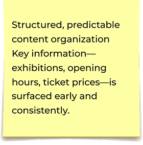
Surface essential info early and group it consistently across screens
Buy Tickets
Limited payment options
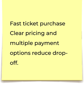
Support multiple payment options and make the ticket flow predictable and fast
Visit Museum
No clear route or visit planning support
Integrate route planning and location access directly into the visit flow
Lorenzo

Lorenzo (Professional User)

Goal: Prepare for exhibitions, access professional-level information, purchase tickets, and plan museum visits efficiently.

Stage
Pain Point
Improvement
Open App
Onboarding feels unnecessary or overwhelming
Make onboarding optional and lightweight
Explore Exhibitions
Too much information presented at once
Prioritize visual storytelling and short descriptions
Find General Info
Content feels chaotic and unstructured
Organize information hierarchically and visually
Buy Tickets
Payment process feels inconvenient
Simplify ticket purchase and support common payment systems
Visit Museum
Navigation feels confusing
Provide simple, contextual navigation and clear next-step guidance
Élise

Élise (Casual Visitor)

Goal: Enjoy a relaxed museum visit with minimal effort and clear, accessible information.

Defining

Value Proposition

Through research and synthesis, two core value areas emerged:
Convenience — reducing friction and making essential museum interactions effortless
Adaptability — allowing the same app to serve users with different levels of art knowledge
This value proposition guided all design decisions and helped maintain clarity around what features were essential and why they mattered.

Convenience

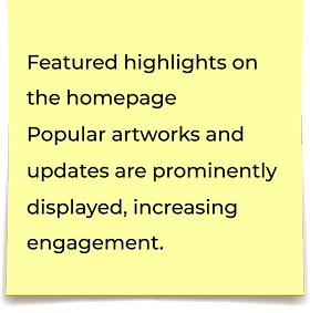
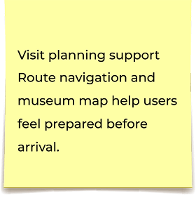
Convenience note 1 Convenience note 2 Convenience note 3 Convenience note 4 Convenience note 5 Convenience note 6 Convenience note 7

Adaptability to User
Needs

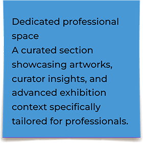
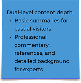
Adaptability note 1 Adaptability note 2

Ideation

Goal Statement

What (Product)

A mobile-first museum application that centralizes essential information, exhibitions, and ticketing in one intuitive platform.

What (Action)

Enables visitors to explore collections, view professional-level insights, purchase tickets in advance, and prepare for their museum visit with minimal friction.

Who

Two primary user groups:

Casual visitors seeking simple, accessible information and easy ticketing

Art professionals who require deeper, structured content about artworks and exhibitions

Why

To eliminate the common frustrations found in existing museum apps—cluttered navigation, lack of mobile optimization, insufficient depth of content—and to provide a seamless digital experience that supports visit planning and increases user engagement.

How

By designing a layered information structure, improving content hierarchy, offering multiple payment options, integrating route navigation, and providing relevant reminders while tracking engagement to support continuous improvement.

Competitive Audit

To understand the competitive landscape, I conducted a competitive audit that included two direct competitors (large international museums) and two indirect competitors (cultural and ticketing platforms).

The goal was to evaluate how effectively each product provides access to essential museum information, supports mobile usability, and communicates value to different user groups.

Through this analysis, I identified consistent accessibility issues, content gaps, and UX inconsistencies that create clear opportunities for differentiation.

Gaps

Opportunities

Competitors such as Kunsthistorisches Museum and the Louvre show inconsistent accessibility support — screen readers struggle with unclear labels, elements, and non-functional interactive elements.

Improve accessibility by ensuring full screen-reader compatibility and adhering to WCAG standards.

Content translations — especially long-form articles — vary in accuracy and clarity. Some sections remain untranslated or poorly localized.

Provide professionally localized multilingual content with editorial consistency.

Many competitor platforms do not clearly explain their core features, value, or navigation structure, forcing users to search for basic information.

Highlight key functionality, simplify navigation, and improve content hierarchy to reduce cognitive load.

Several apps and websites do not automatically adjust currency or local settings, which confuses international visitors.

Implement automatic or easily adjustable currency and location settings to support global users.

Prototyping and Testing

Primary User Flow

This is the primary path users take to explore exhibitions and purchase tickets.

Primary user flow diagram for exploring exhibitions and purchasing tickets

This user flow focuses on reducing friction in the ticket-purchase process by keeping navigation simple and eliminating unnecessary steps. It reflects the core user needs identified during research — fast access to collections, structured information, and a predictable checkout experience.

This flow directly addresses the main pain points identified during research — difficulty finding ticket information, overloaded content, and inconvenient mobile navigation.

Design Priorities

  • Reduce friction during ticket purchase
  • Provide optional, non-blocking onboarding
  • Keep navigation predictable and aligned with user mental models

Future Considerations

  • Add alternative paths for payment errors
  • Introduce a clearer back-navigation system
  • Support deep links for exhibitions and tickets

Storyboard

This storyboard illustrates the primary user scenario identified during research: exploring exhibitions and purchasing tickets ahead of the visit. Each step reflects key pain points (unclear structure, missing details, slow navigation) and informs how the final flow reduces friction, improves clarity, and speeds up decision-making.

Big-Picture Storyboard

Lorenzo is planning his upcoming trip and decides to visit an art museum.

He opens the museum’s app to learn more about it and purchase a ticket.

He opens the general information about the museum.

He reads about the available exhibitions and displays and chooses the one he’s interested in.

He immediately proceeds to purchase the ticket he needs.

He is happy because he visits the exhibition without any lines and with comfort.

Close-Up Storyboard

This close-up storyboard breaks down the key interaction steps in the ticket-purchase flow. It highlights usability issues identified during research—unclear page hierarchy, missing shortcuts, and unnecessary steps—and demonstrates how the refined flow improves clarity, reduces friction, and enables fast, confident decision-making.

Lorenzo is planning his upcoming trip and decides to visit an art museum.

He opens the museum’s app to learn more about it and purchase a ticket.

He opens the general information about the museum.

He reads about the available exhibitions and displays and chooses the one he’s interested in.

He immediately proceeds to purchase the ticket he needs.

He is happy because he visits the exhibition without any lines and with comfort.

High-Level Information Architecture

To ensure clear navigation and a scalable structure, I created a high-level Information Architecture for the app.

The goal was to:

  • simplify navigation patterns
  • reduce cognitive load
  • structure content according to the main user tasks identified during research
  • avoid duplication across sections
  • support future expansion (new exhibitions, events, collections)

I grouped the content into four main pillars: Homepage, Exhibitions, Collections, and Ticketing — each optimized for both casual visitors and professionals.

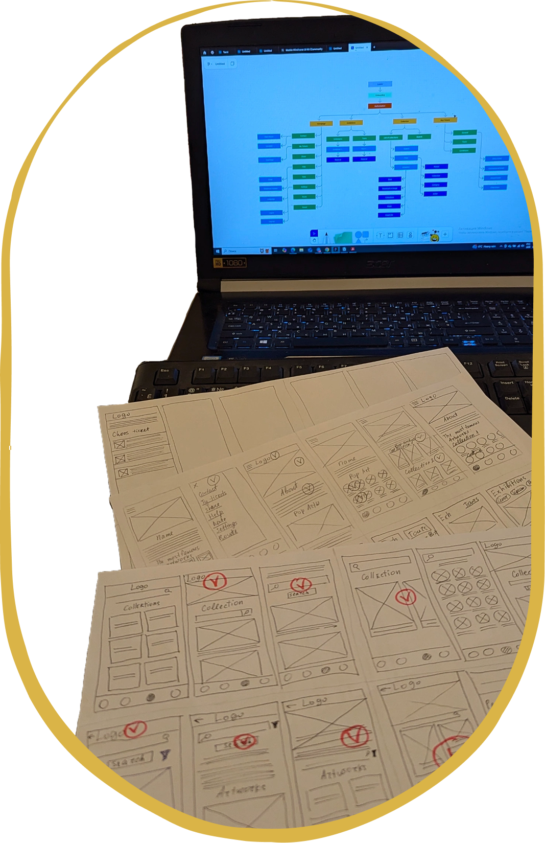
High-level information architecture diagram

Note: The diagram below represents a high-level structure.
Detailed IA documentation (labels, metadata, content inventory) was created separately for development.

Key IA Decisions

  • Separated “Collections” and “Exhibitions” to reduce confusion between permanent and temporary content.
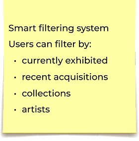
  • Introduced a unified “Search & Filters” system across artworks, artists, and exhibitions for consistency.
  • Simplified onboarding — users can skip login and still browse essential information.
  • Merged secondary pages (language, help, contact, saved items) into one Account section to avoid clutter.
  • Ticketing flow redesigned to minimize steps and support multiple ticket types.

Wireframes

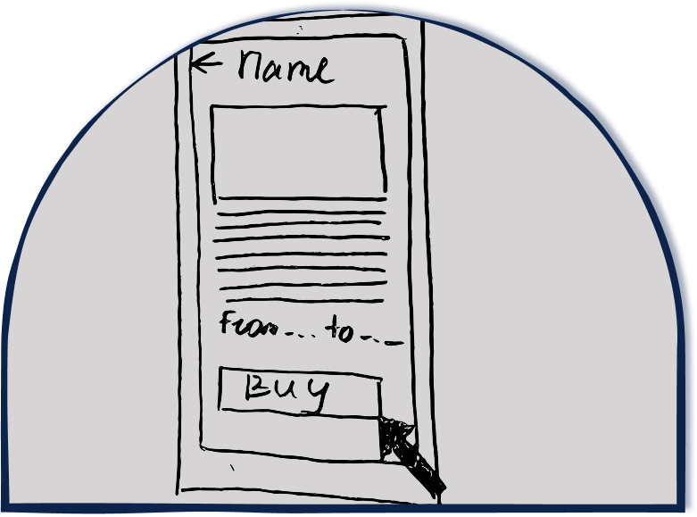
Paper Wireframes

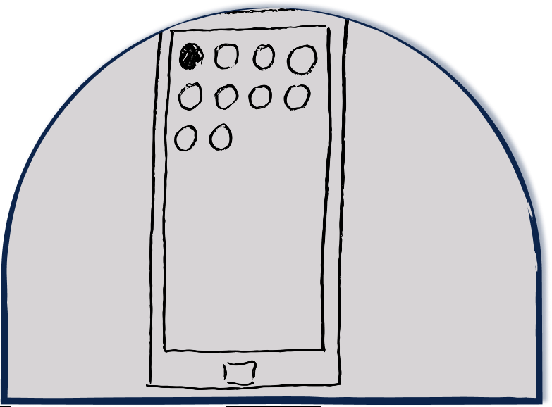
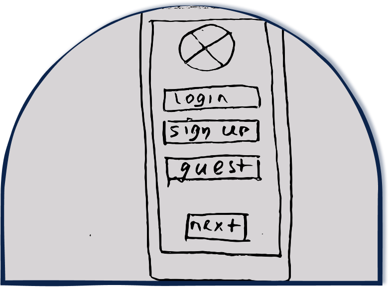
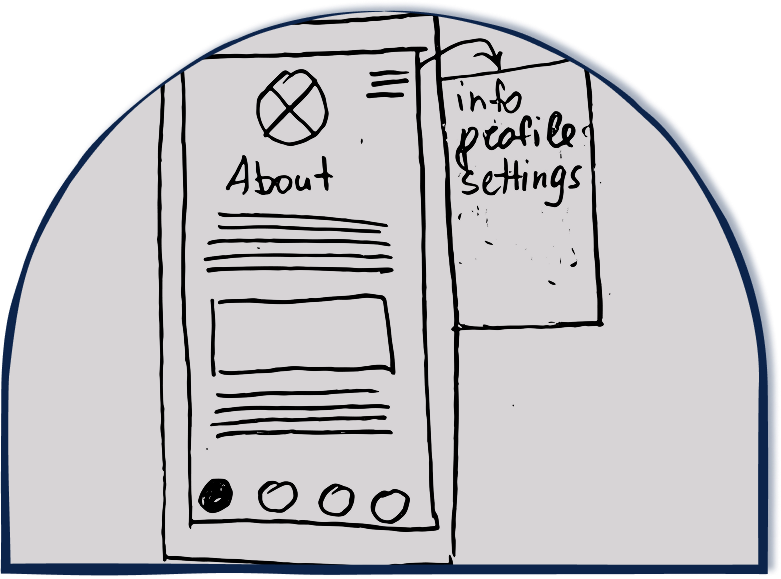
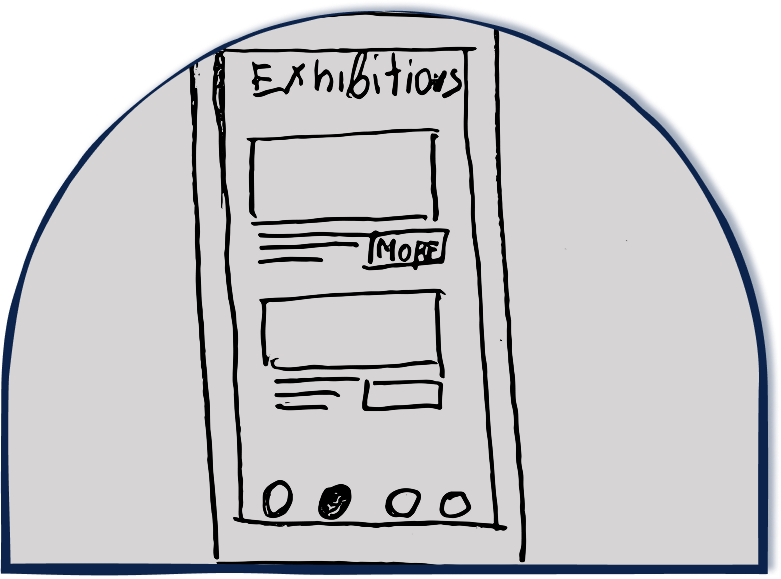
Before moving into Figma, I begin with rapid paper sketching to quickly explore multiple layout directions and interaction patterns.

This step allows me to:

  • generate a wide range of concepts without constraints
  • validate structural ideas early
  • identify patterns that best support the core user tasks
  • reduce the number of iterations needed later in high-fidelity design

Paper wireframes are a fast way to test assumptions, compare alternatives side by side, and align UI decisions with the research findings before moving into more detailed digital wireframes.

Paper wireframes sketches for the Artpass app

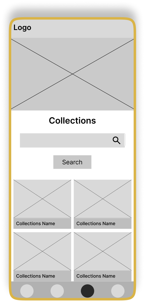
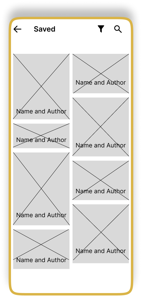
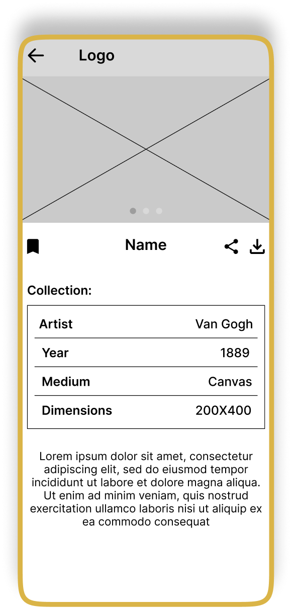
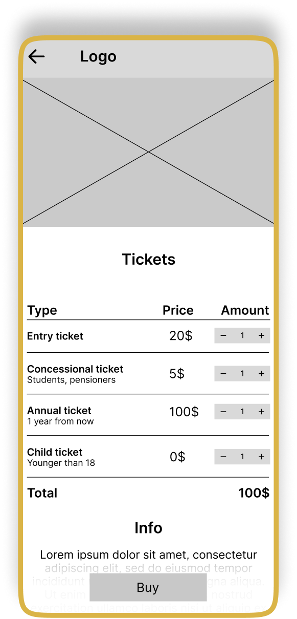
Digital Wireframes

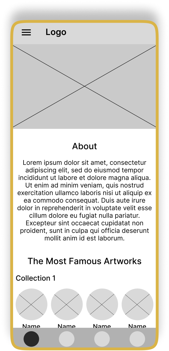
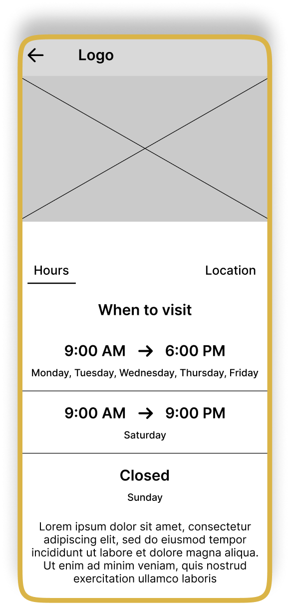
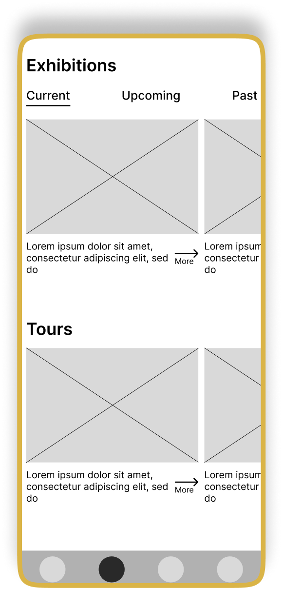
After defining the core structure through paper sketches, I transitioned to digital wireframes to formalize the layout, interaction patterns, and information hierarchy.

At this stage, the goal was to validate how well the concepts supported key user flows — browsing collections, checking museum information, and purchasing tickets.

Creating digital wireframes allowed me to:

  • refine navigation and screen-to-screen logic
  • ensure consistency across components
  • test different layout variations before committing to high-fidelity UI
  • align structure with accessibility and usability principles
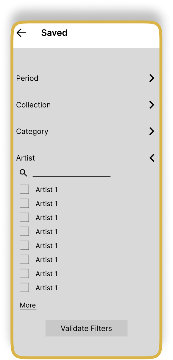
Homepage wireframe Visit hours wireframe Exhibitions and tours wireframe Collections wireframe Saved items wireframe Artwork detail wireframe Buy tickets wireframe Save filters artist wireframe

Usability Study

Top Findings:

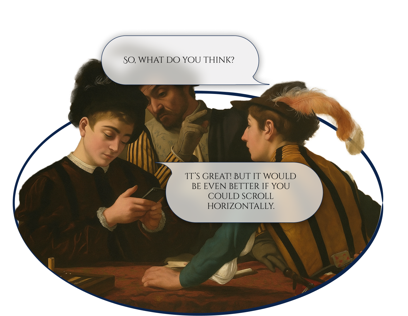
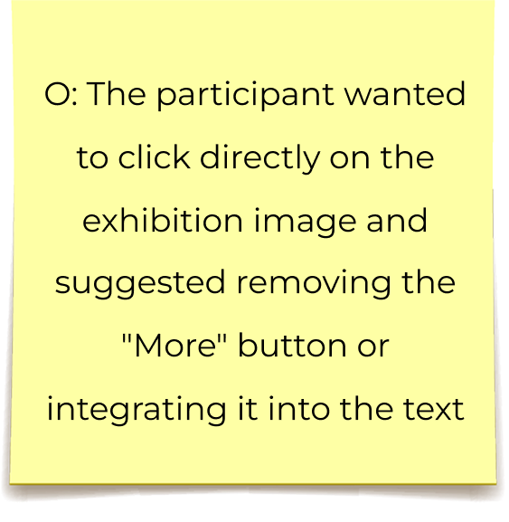
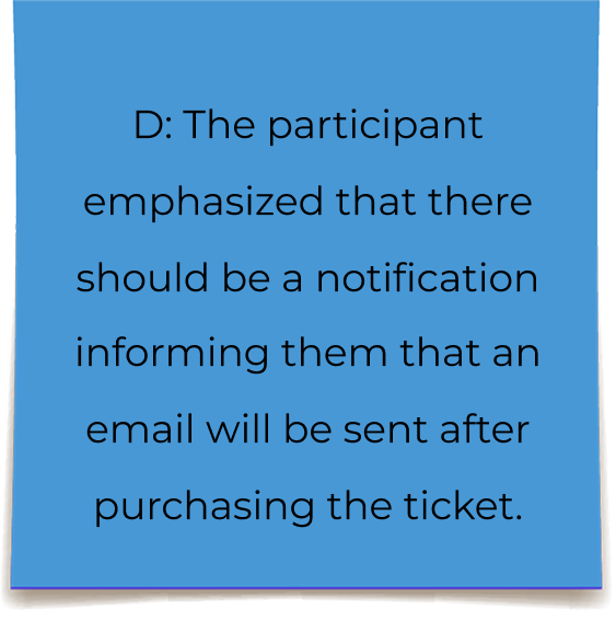
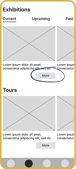
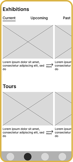
  • Users expected image clickability on the Exhibitions screen
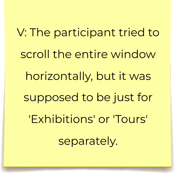
  • Vertical scrolling felt unintuitive
  • The stepper lacked clarity during booking
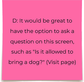
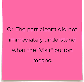
  • “Visit” label wasn’t clear to casual users
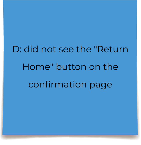
  • Confirmation screen CTA lacked visibility
Usability study participants discussing the prototype

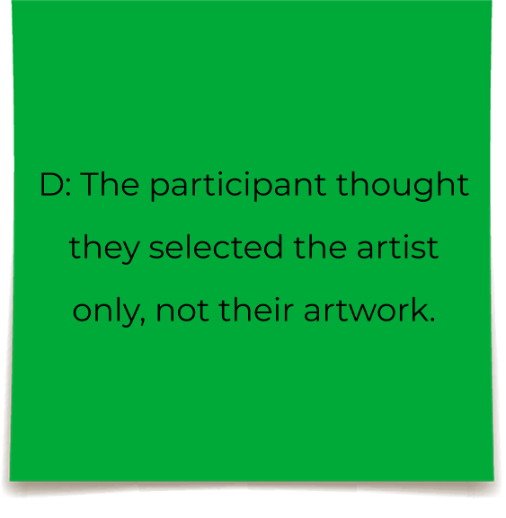
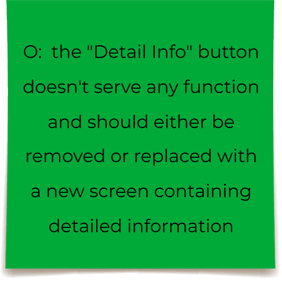
To synthesize the data collected during the usability study, I created an Affinity Diagram. The identified potential issues were grouped into four main categories:

Exhibitions/Tours

Purchasing

Artwork

Information

Impact:

  • Reduced task completion friction in ticket booking flow
  • Improved clarity of navigation
  • Eliminated unnecessary steps (–1 screen)
  • Increased perceived usability based on participant comments

Improvements

Insight

Users instinctively tried to tap exhibition images instead of secondary “More” buttons.

Change

Exhibition cards were made fully clickable, allowing direct navigation via images.

Impact

Reduced interaction friction and aligned the interface with common mobile behavior patterns.

Insight

Users did not immediately understand the purpose of the booking stepper during ticket selection.

Change

Clear labels were added to each step to communicate progress and required actions.

Impact

Increased clarity in the booking flow and reduced hesitation during checkout.

Insight

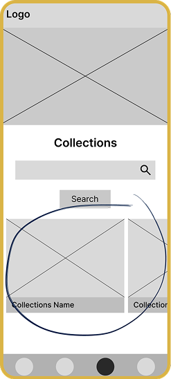
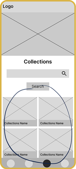
Participants found horizontal scrolling uncomfortable and unintuitive on mobile devices.

Change

The collections layout was redesigned to use vertical scrolling while preserving search and filtering.

Impact

Improved content discoverability and reduced cognitive load during browsing.

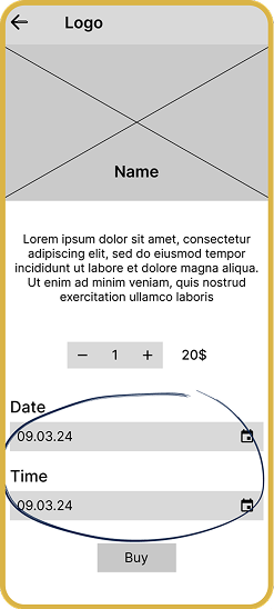
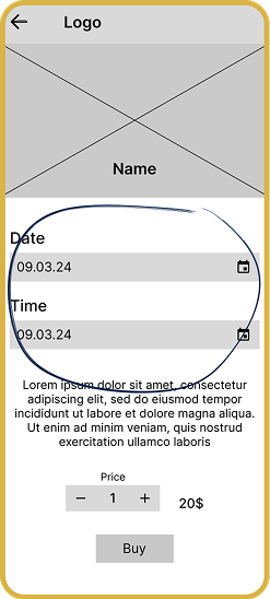
Insight

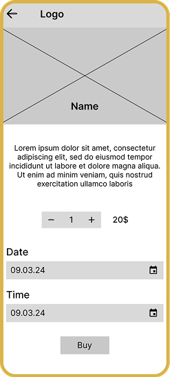
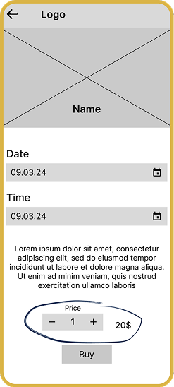
Users expected the visit date to appear before pricing information when booking tickets.

Change

The layout hierarchy was adjusted to display date and time above ticket price.

Impact

Supported faster decision-making and improved perceived control over the booking process.
HiFi Design

Typography

Artifex CF was chosen for its expressive serif character, which supports the app’s art-focused identity. Its non-minimalist yet elegant style complements artworks without overpowering them and remains readable across different screen sizes.

Typography styles used in the Artpass app

Color

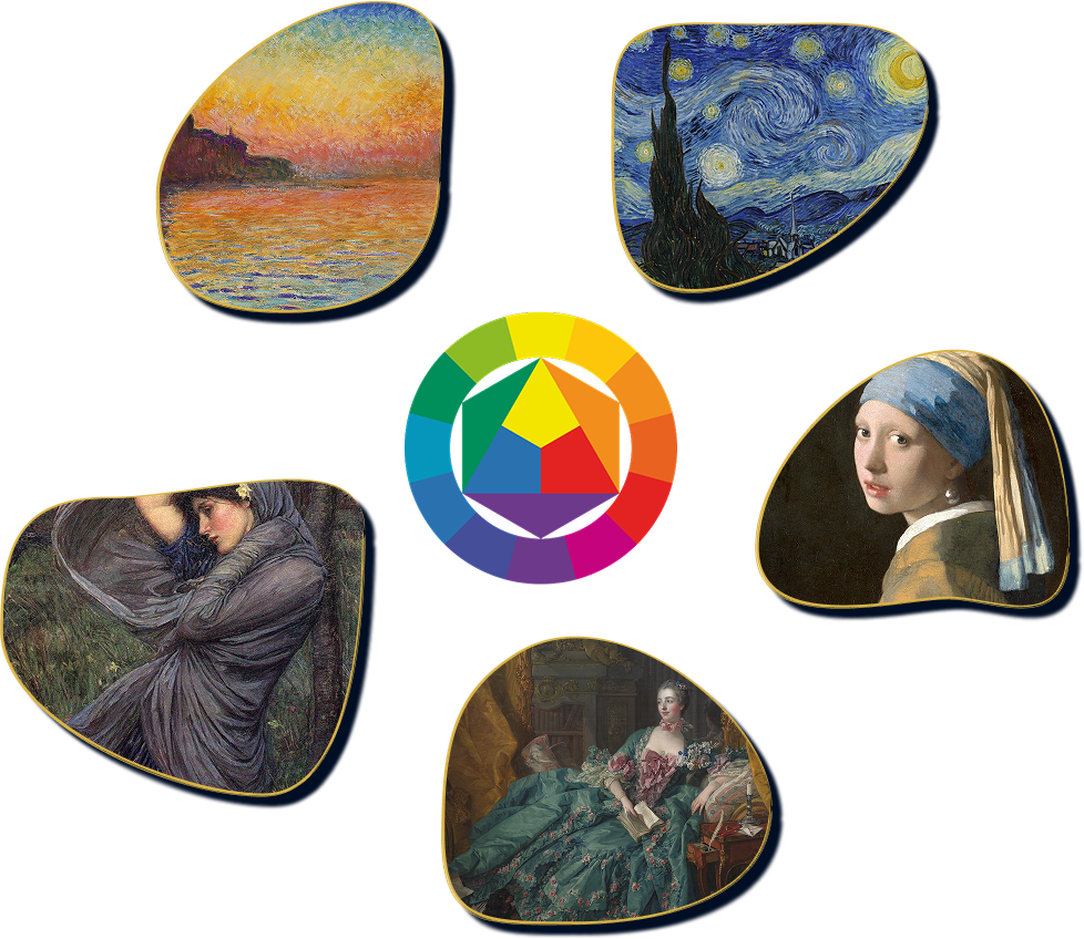
The color palette is inspired by classical artworks, where deep navy tones are often paired with warm yellow highlights. This combination provides strong contrast, supports the app’s artistic identity, and ensures readable interfaces on both light- and dark-themed backgrounds. The accent yellow is used sparingly to highlight key actions and interactive elements.

Accent Color: #DAB447
Secondary Color: #D7D4D6
Primary Color #0C244B
Art-inspired color palette for the Artpass app

Sticker Sheet

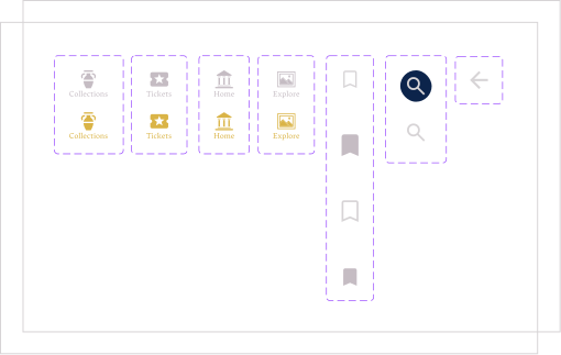
Icons

Icons sticker sheet

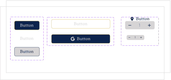
Buttons

Buttons sticker sheet

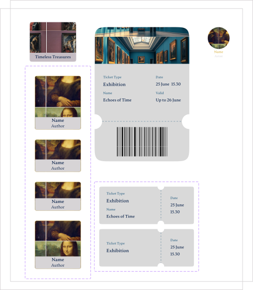
Cards

Cards sticker sheet

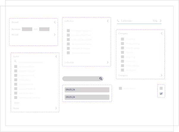
Forms/inputs

Forms and inputs sticker sheet

Modals

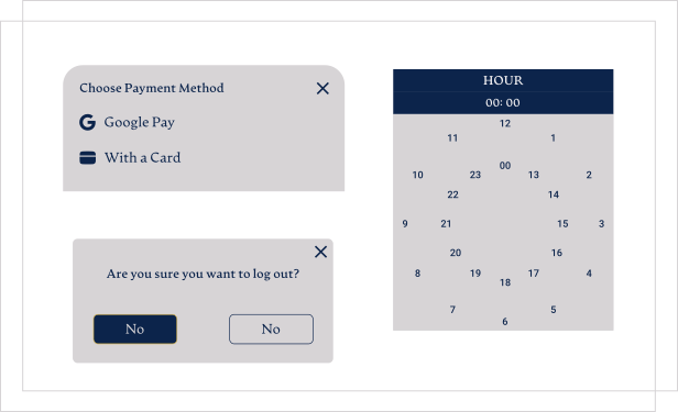
Modals sticker sheet

High Fidelity

Onboarding

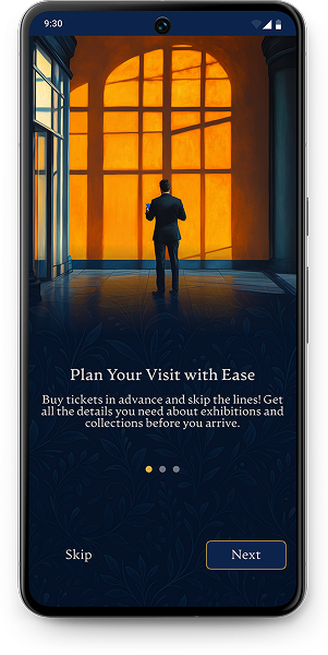
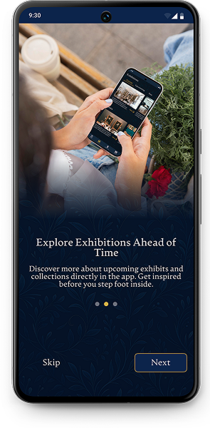
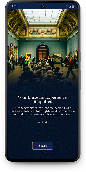
The onboarding flow introduces key app features, helping first-time visitors understand how to plan visits, explore exhibitions, and purchase tickets seamlessly.

Onboarding screen 1 Onboarding screen 2 Onboarding screen 3

Authorization

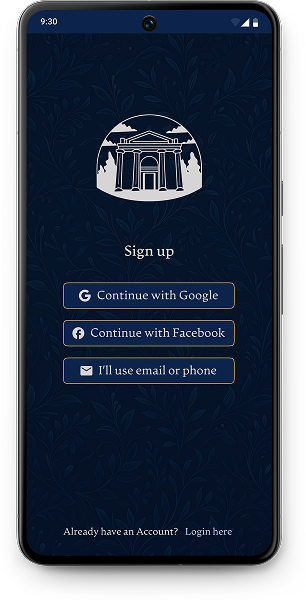
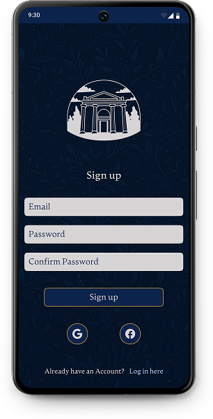
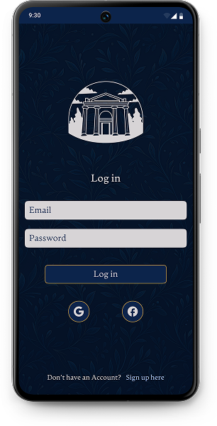
The authorization flow was designed to provide users with a smooth and reliable entry into the app. Since many museum visitors access the app on-the-go, the priority was to minimize friction, reduce typing, and offer fast access via social login options. The flow supports both quick sign-in and traditional email-based registration for users with different privacy preferences.

Authorization screen 1 Authorization screen 2 Authorization screen 3

Homepage Flow

Goal

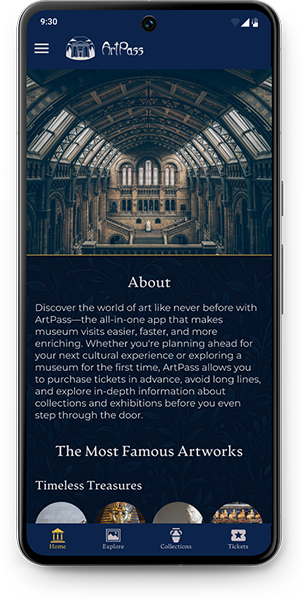
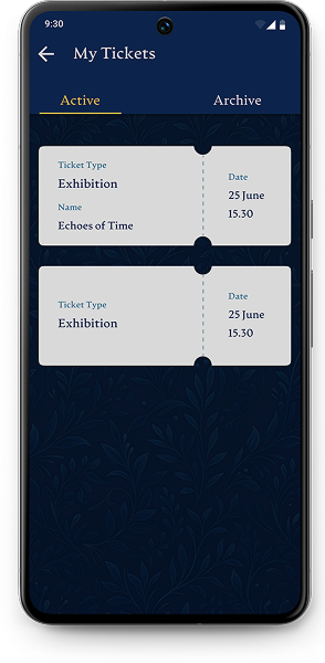
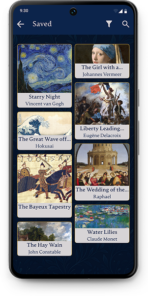
Provide quick access to key information (museum info, tickets, saved items) while supporting both casual browsing and on-the-go usage.

Key Decisions

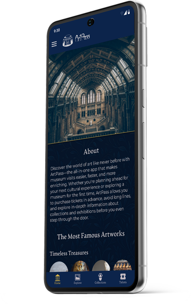
  • Clear hierarchy: about section + popular artworks placed upfront.
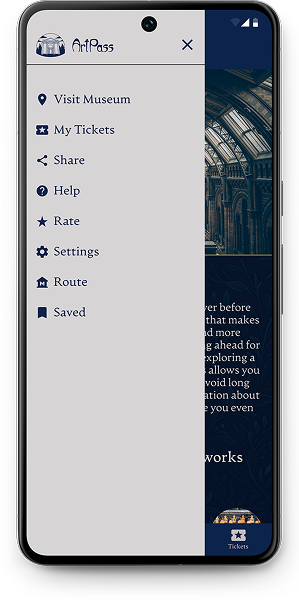
  • Hybrid navigation: bottom bar for frequent tasks, side menu for secondary actions.
  • Fast ticket access: reachable from both homepage and main navigation.
  • Visual-first cards: artworks and tickets prioritize recognition over text.
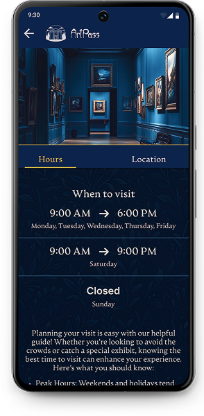
  • Visit planning: hours & location structured for quick, real-world lookup.

Impact

  • Faster navigation
  • Reduced cognitive load
  • Improved task completion during museum visits
  • Higher engagement through visual content
Homepage mockup Side menu mockup My tickets mockup Saved mockup Museum info mockup Ticket mockup

Exhibitions/Tours Flow

Goal

Enable users to effortlessly explore exhibitions and book guided tours with minimal friction.

Key Decisions

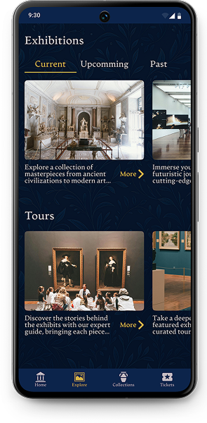
  • Split tabs (Current / Upcoming / Past): fast wayfinding and clear content segmentation.
  • Fully clickable cards: optimized after testing; direct navigation via images.
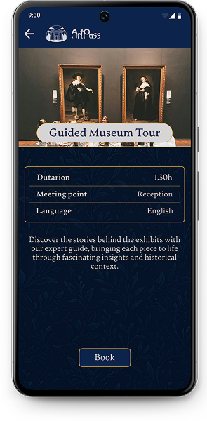
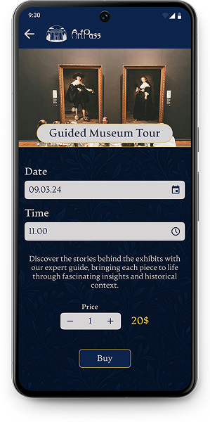
  • Two-step booking: first info → then date/time selection to reduce cognitive load.
  • Clear price controls: simplified quantity selector for quicker checkout.
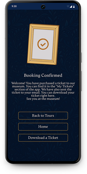
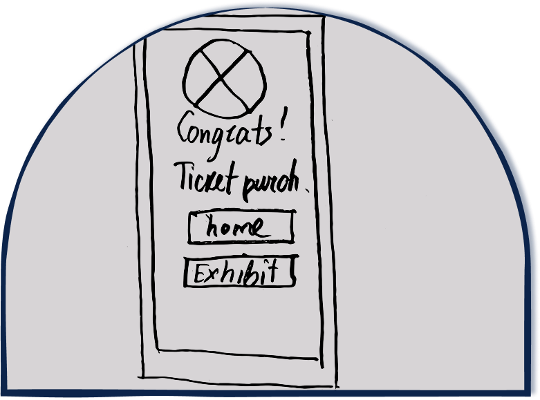
  • Strong confirmation screen: clear next steps + immediate ticket access.

Impact

  • Faster booking time
  • Increased task success rate in usability testing
  • Better content discoverability
  • More intuitive flow for first-time visitors
Exhibitions mockup Tour mockup Tour purchasing mockup Confirmation mockup

Collections Flow

Goal

Help users quickly explore museum collections, filter artworks, and access detailed information without cognitive overload.

Key Decisions

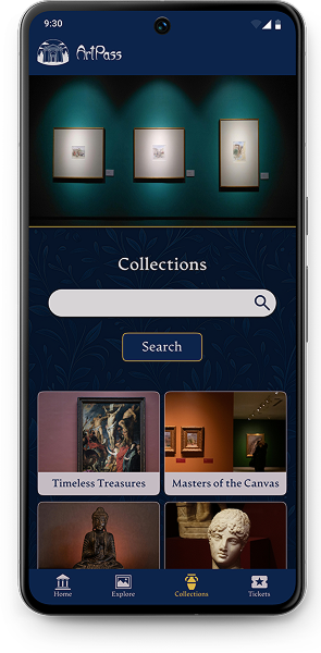
  • Prominent search + preview cards: streamlined discovery for both casual and expert visitors.
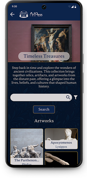
  • Collection overview pages: provide narrative context before diving into artworks → supports deeper engagement.
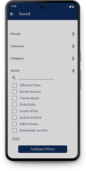
  • Flexible filtering (period, category, artist): designed based on interview insights from both personas.
  • Saved filters panel: collapsible sections to keep the interface clean and reduce scrolling.
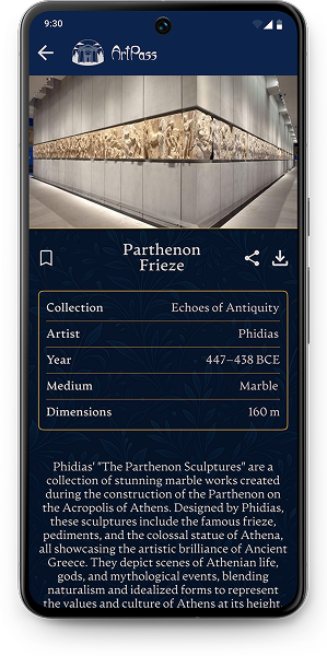
  • Detailed artwork view: structured metadata (artist, year, medium, dimensions) + short description for professionals.

Impact

  • Faster artwork discovery
  • Reduced navigation friction (fewer taps to reach item-level content)
  • Higher clarity for professional-level users
  • More intuitive filtering flow, validated through early testing
Collections mockup Collection mockup Filter mockup Artwork mockup

Tickets Flow

Goal

Streamline the ticket-purchasing experience so users can quickly select a ticket type, adjust quantities, and complete checkout with minimal friction.

Key Decisions

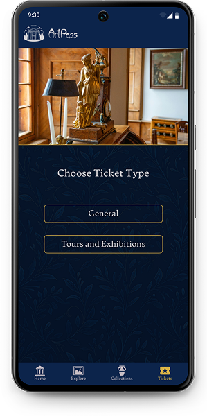
  • Two-step structure (type → selection): reduces cognitive load and helps users understand the available options before seeing pricing.
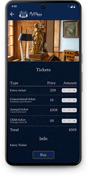
  • Compact ticket table: clear hierarchy (type → price → amount), optimized for quick scanning and comparison.
  • Increment controls: designed for mobile ergonomics and fast quantity adjustment.
  • Contextual “Info” section: allows users to see ticket details without leaving the flow, reducing interruptions.
  • Single CTA (“Buy”): placed after the cost summary to support confident decision-making.

Impact

  • Faster checkout thanks to simplified steps
  • More transparent pricing, reducing hesitation
  • Higher clarity for different user groups (students, families, annual visitors)
  • Fewer errors during quantity selection due to better control layout
Ticket type mockup Tickets mockup

Takeaways

This project reinforced the importance of early validation and scope reduction.

User testing highlighted clear behavior patterns (image clickability, scrolling expectations, clarity of labels), which drove simplification of key flows.

By removing unnecessary steps and restructuring navigation, I reduced cognitive load and improved task completion efficiency.

The process emphasized that strong UX comes from continuous iteration, prioritization, and adapting initial assumptions to real user needs.